Rožnov pod Radhoštěm
Client: Rožnov pod Radhoštěm
Contractor: Rožnov pod Radhoštěm
Cooperation: Eliška Fenclová
Year: 2021
Status: Unrealized
Type: Visual Identity, Branding
Rožnov ~ The town described by adjectives
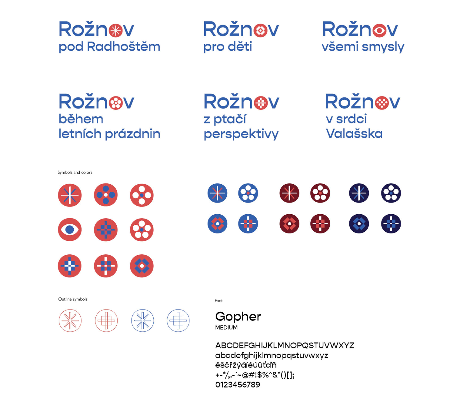
When you say Rožnov, perhaps everyone thinks of the town Rožnov pod Radhoštěm. Therefore we have decided to go with the flow and create main logotype of the name Rožnov. Since the current world is fast and noBy adding "pod Radhoštěm", we developed the idea of different adjectives helping us describe uniqueness of the town.
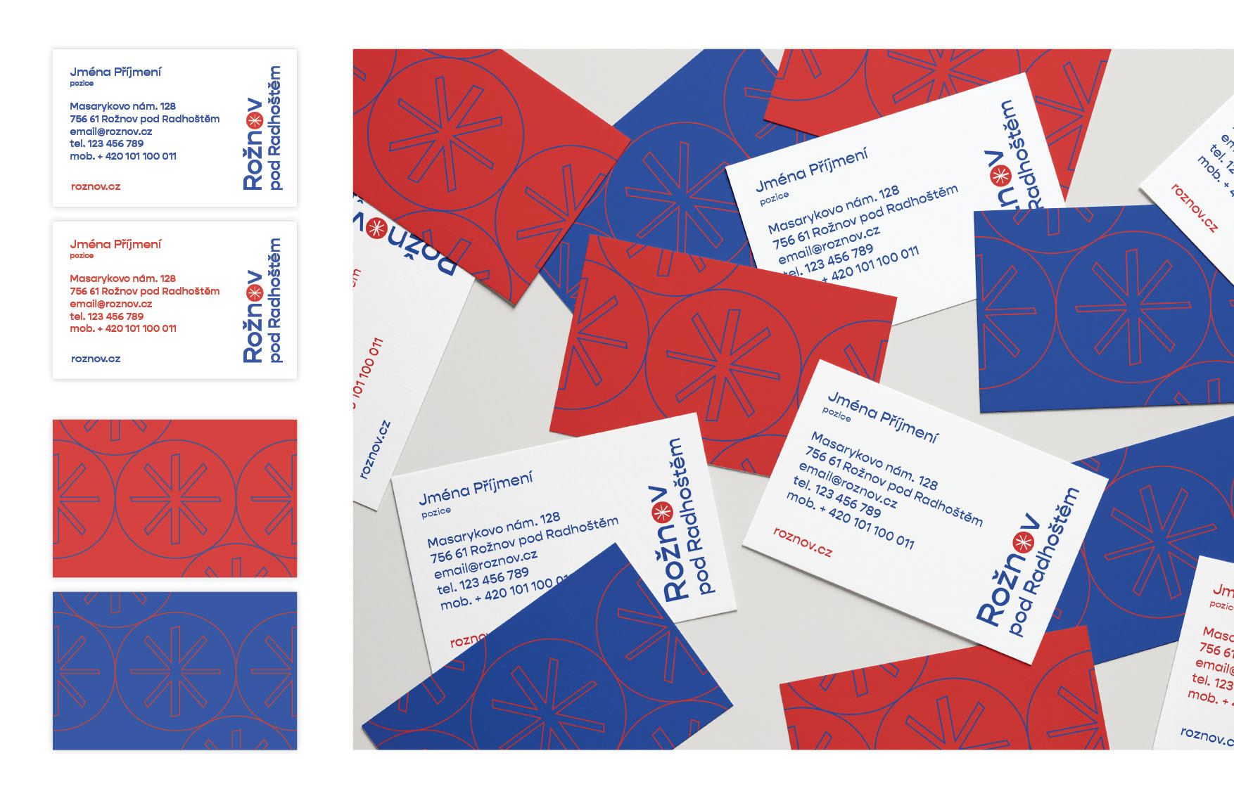
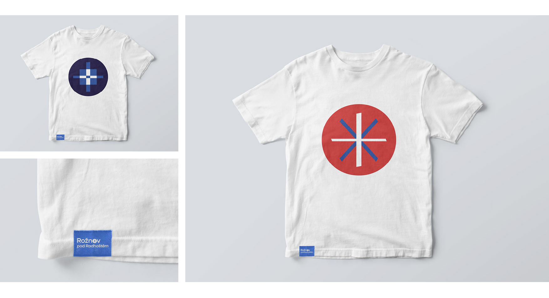
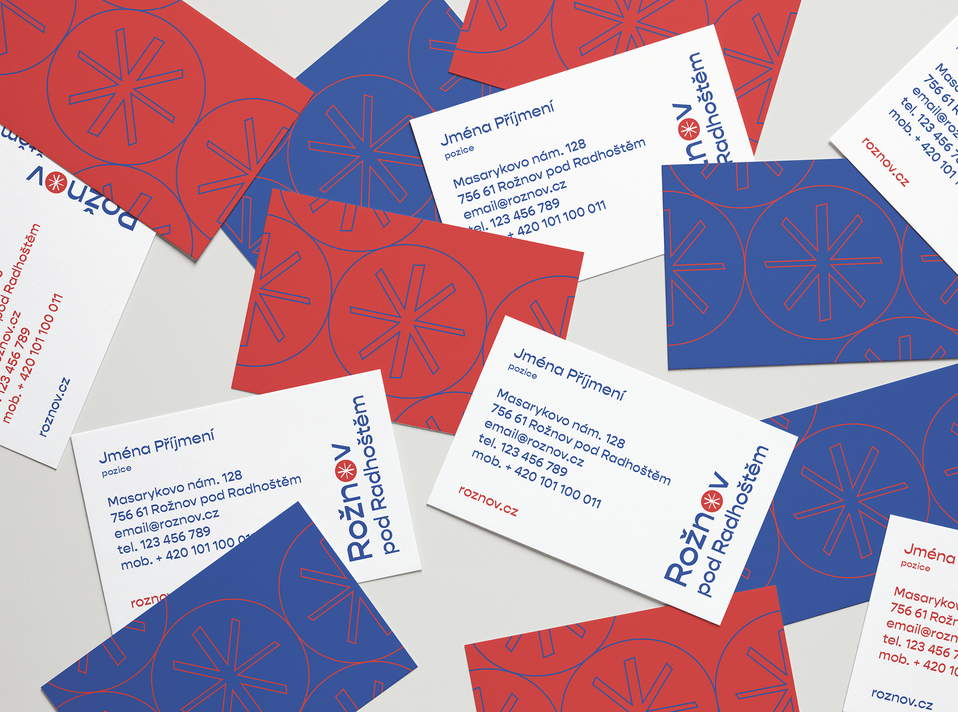
Regarding to the tradition and history of the city, the main logotype is designed to harmonize well with the city emblem and is inspired by Rožnov folk culture. The logotype is based on the sans serif Gopher typeface, which is modern, visually clean. Furthermore thanks to its inverted strokes it is playfull and easy to remember.
The classic geometric shapes in the symbol may speak more to the elderly population, as they refer to the traditional concept of historic buildings and folk culture, while its playful changes suggest that living in Rožnov pod Radhoštěm or visiting this city will definitely not be boring.
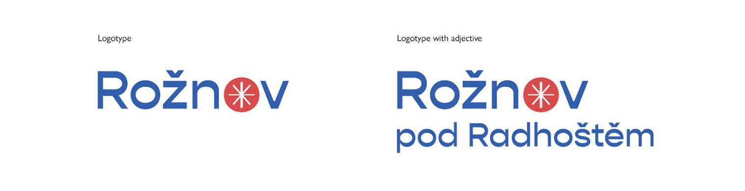
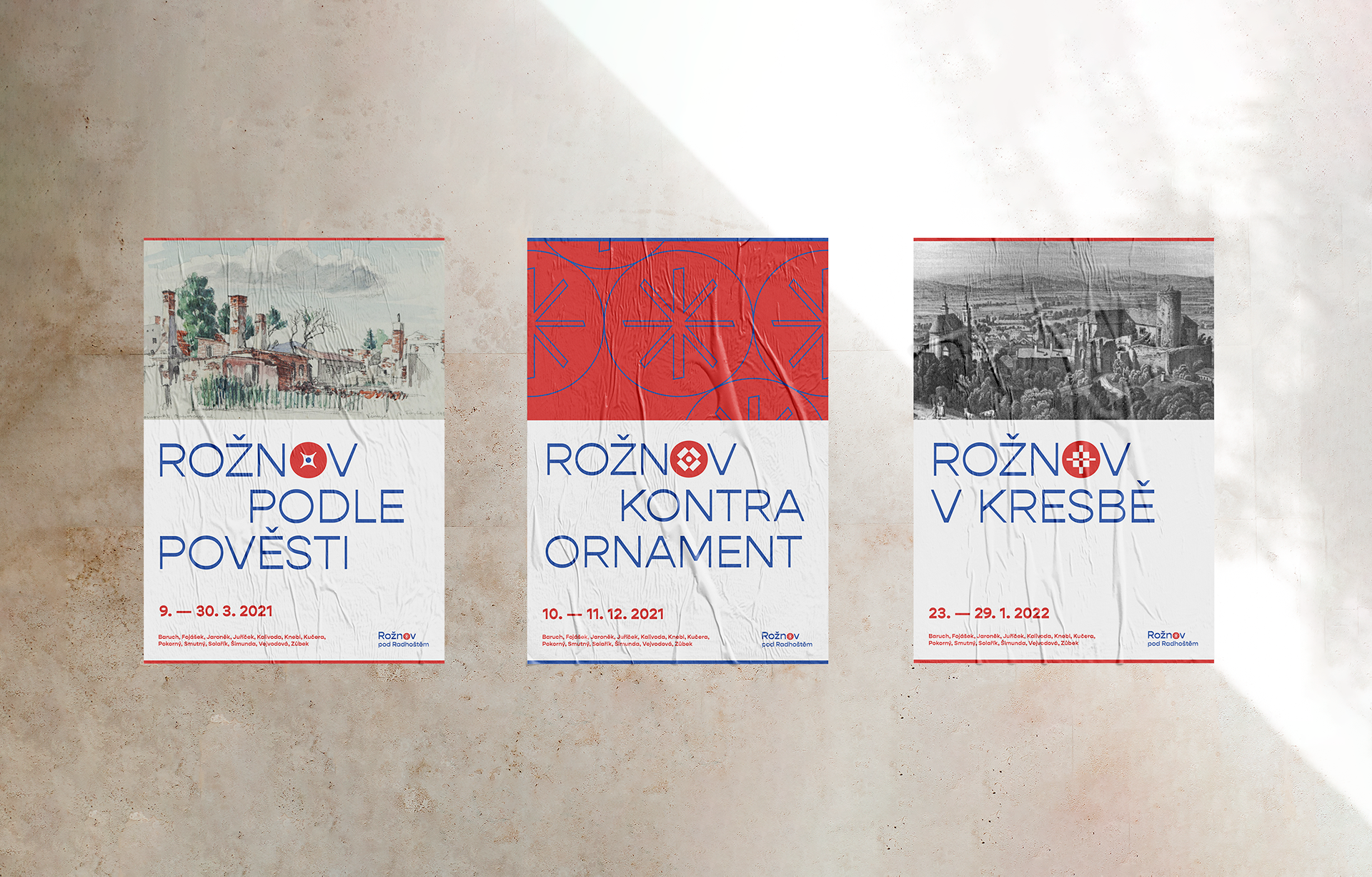
Examples of the adjective written bellow describes the colorful spirit of the city, its culture, history, the life of its inhabitants. They can be used to point to monuments, places, traditions or nature. Symbol in letter O vary with different adjectives.
Rožnov + preposition + noun
Examples:
Rožnov pod Radhoštěm
pro lidi / děti
v srdci Valašska
všemi smysly
z ptačí perspektivy
během letních prázdnin
podle pověsti
v létě
mezi kopci
bez smogu
v srdci Valašska
všemi smysly
z ptačí perspektivy
během letních prázdnin
podle pověsti
v létě
mezi kopci
bez smogu