Restaurace Zvon
Client: Restaurace Zvon
Contractor: BECHYNSKY
Cooperation: BECHYNSKY
Year: 2020
Status: Completed
Type: Redesign, Branding, CI
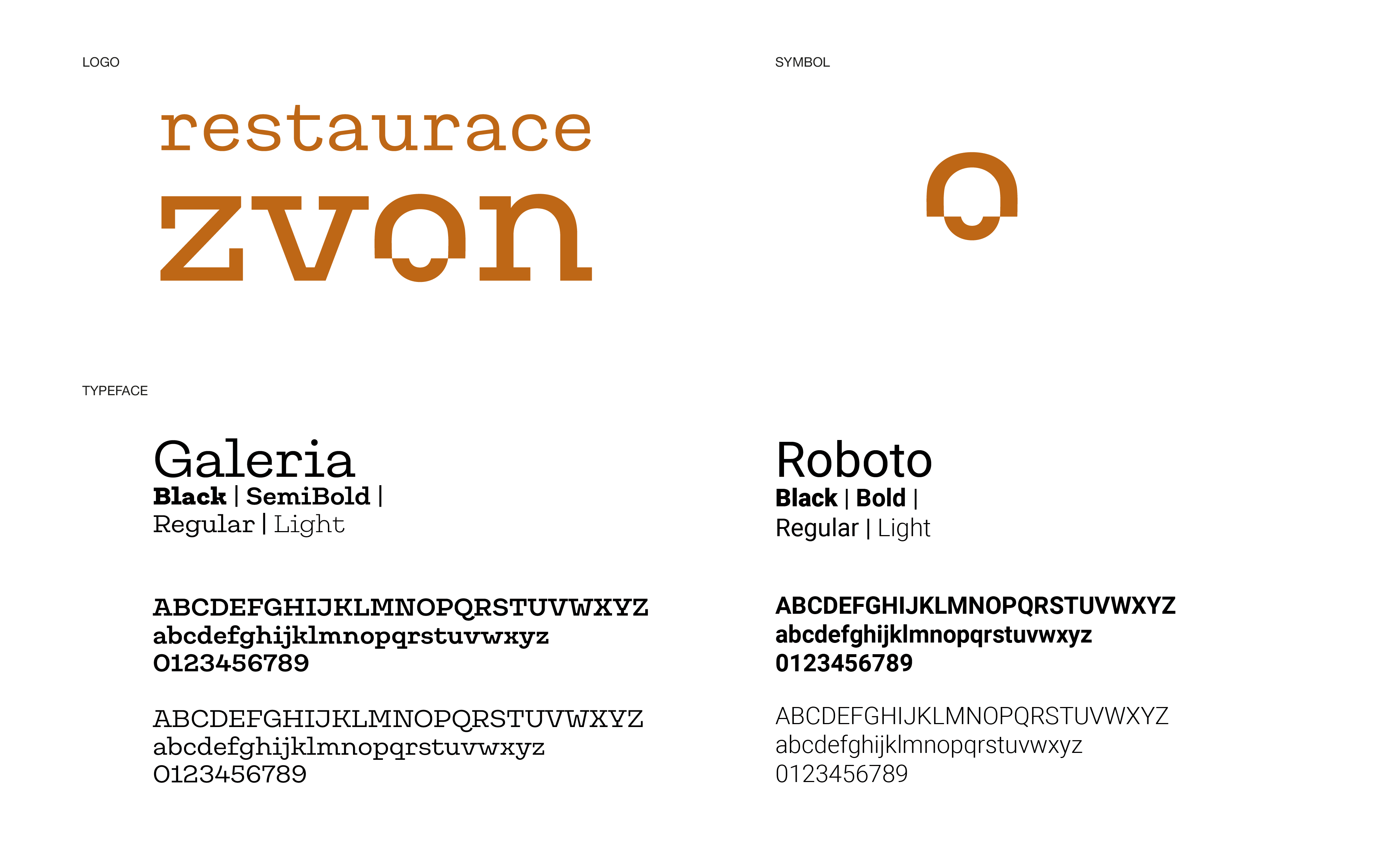
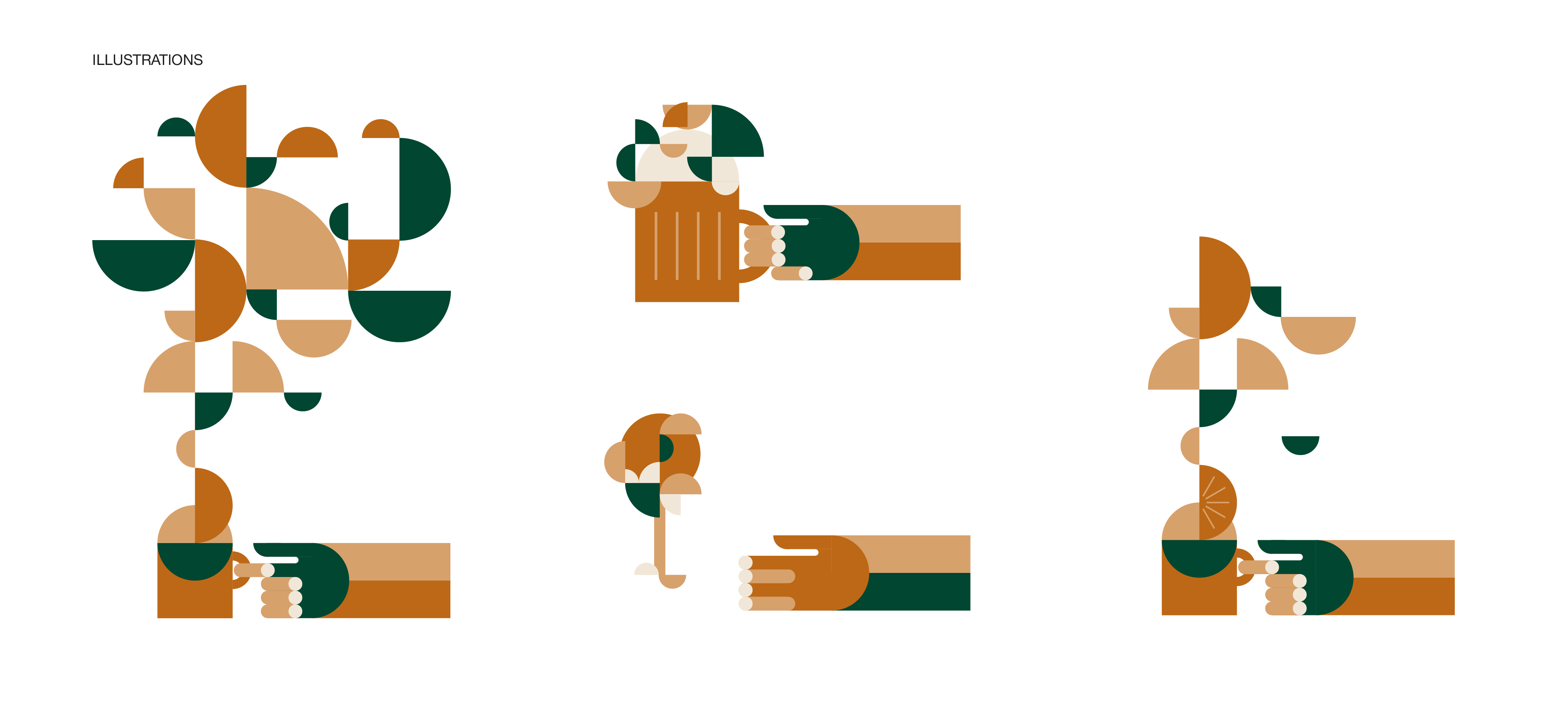
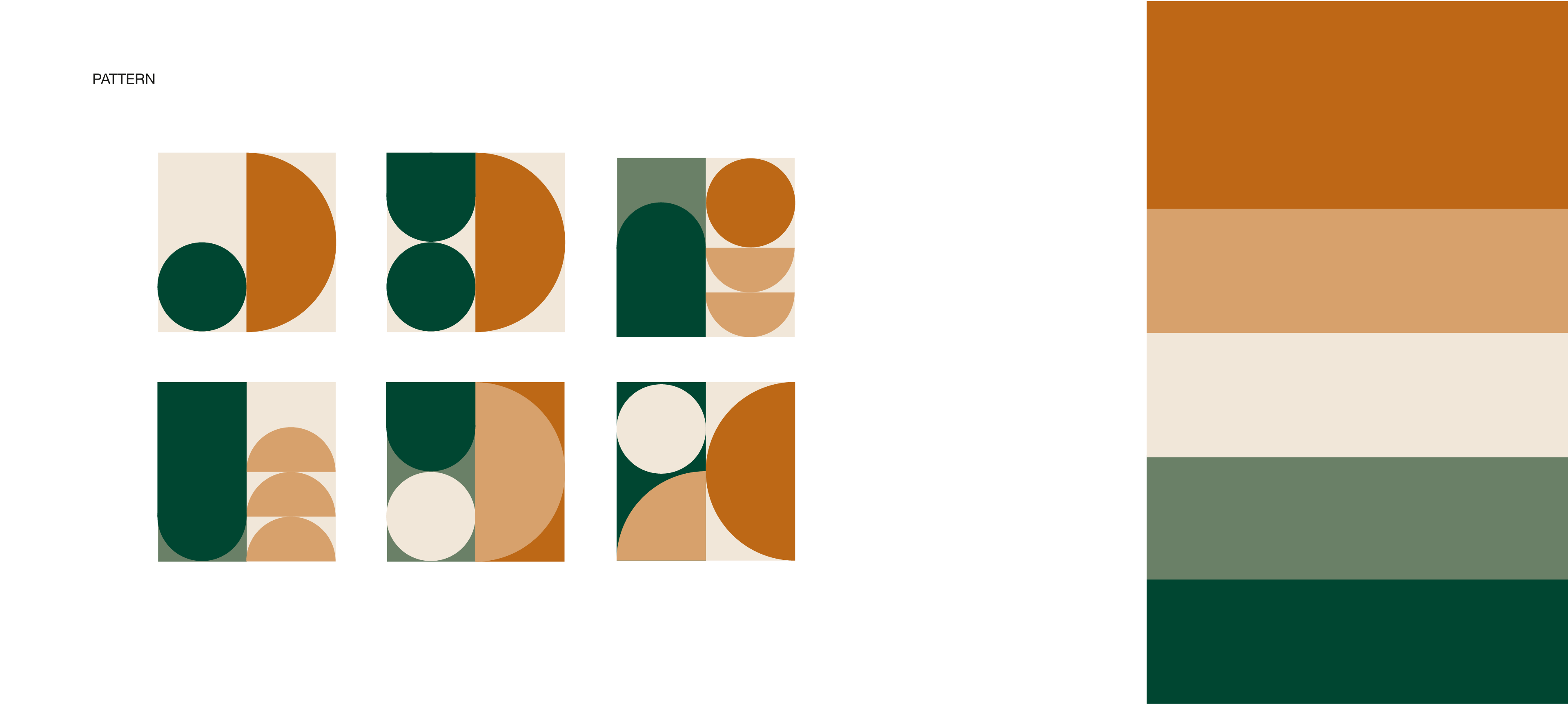
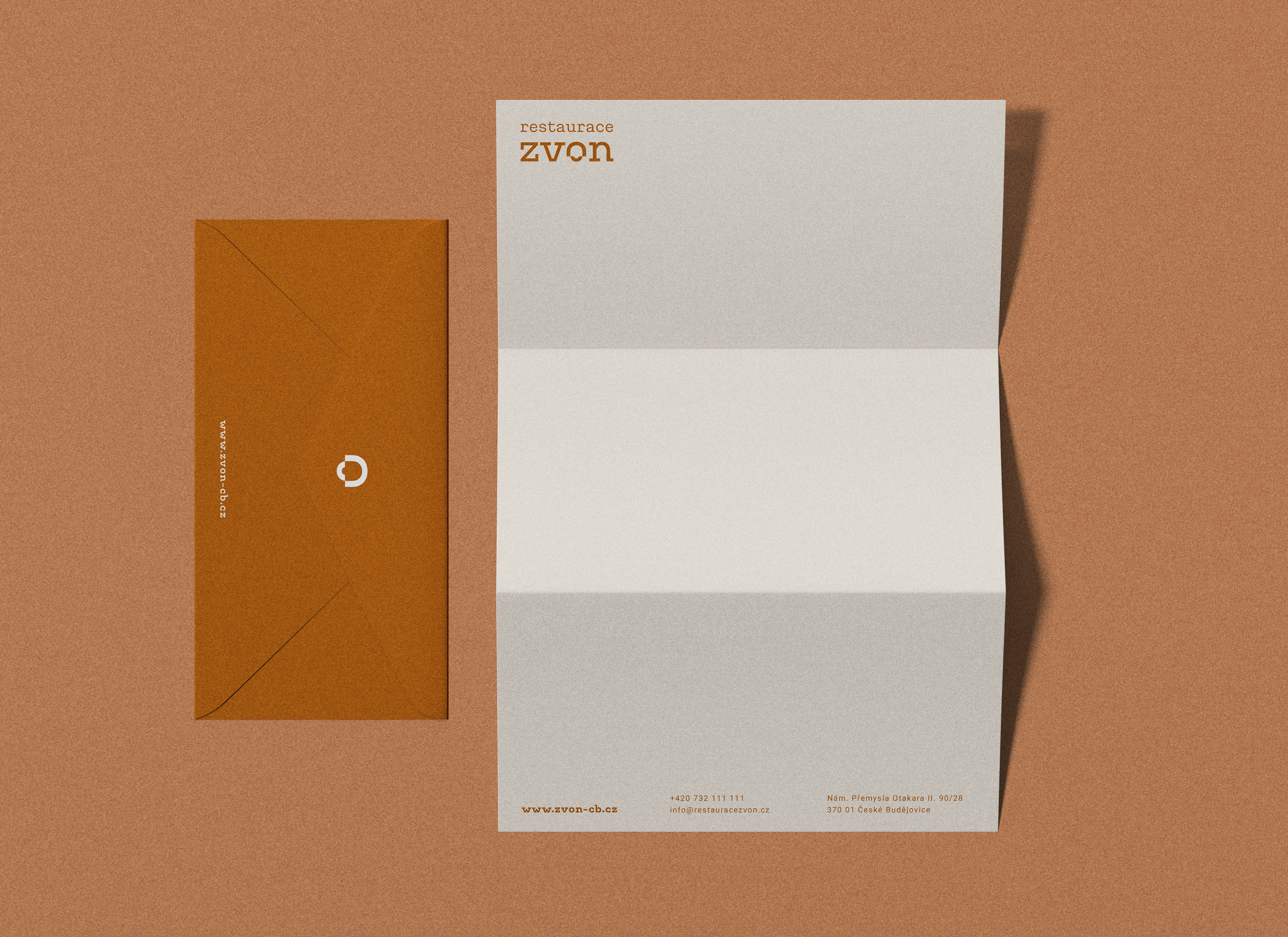
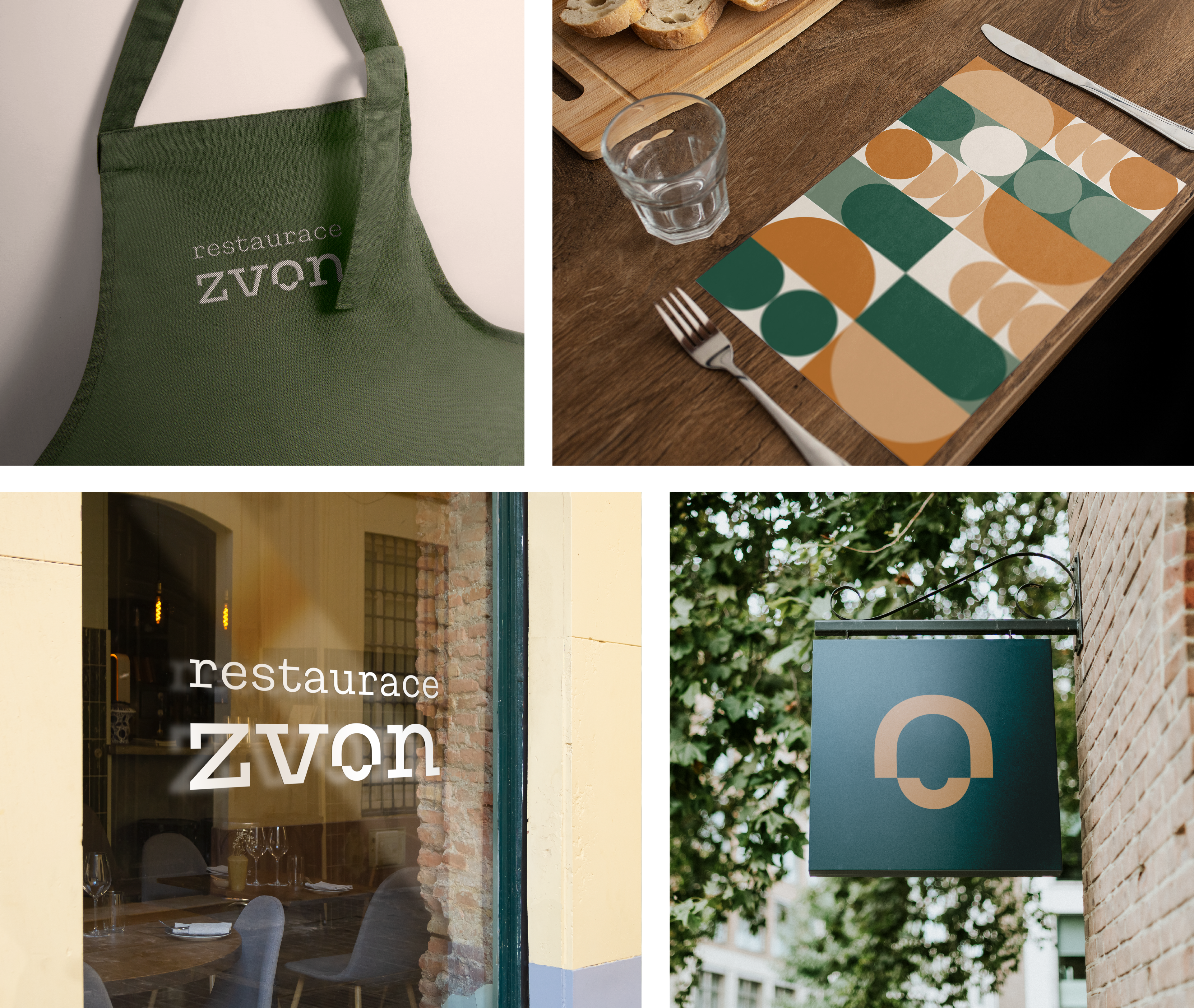
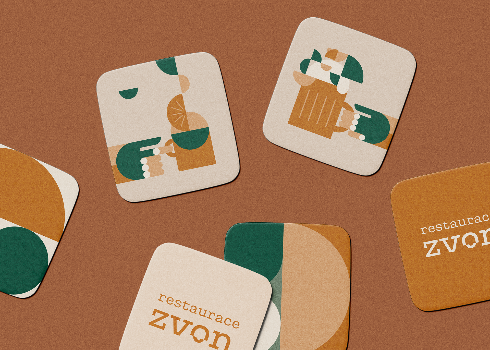
Bell Restaurant has been sensitively renovated with the old concept of the building in mind and the developers of this pilsner pub have captured the spirit and atmosphere of the original. Therefore shortly after the renovations there was a need to develope also a new visual identity for this traditional restaurant. Finding inspiration in the new interior design as well as in historical drawings of the previous logotype, the new logo and identity was created. The bell symbol is gently incorporated into the logotype and work as the letter o but also as the unique symbol for the Bell Restaurant. The serif font takes us a little bit back to the historic era, but its geometric lines gives an contemporary feeling. There were also created original illustrations to support the overall impression of a traditional Czech pub.