Městská knihovna Beroun
Client: Městská knihovna Beroun
Contractor: Picknick
Year: 2024
Status: Tender - 2nd place
Type: Visual Identity, Branding
Beroun City Library is a cultural institution with a long history that offers not only book lending, but also cultural events, educational programs, and community services. The goal of the logo redesign is to reflect the library’s expanded services, including the creation of a community space for both children and adults to gather. The library is not just about books — it's about people, connection, stories, and the joy of discovery.
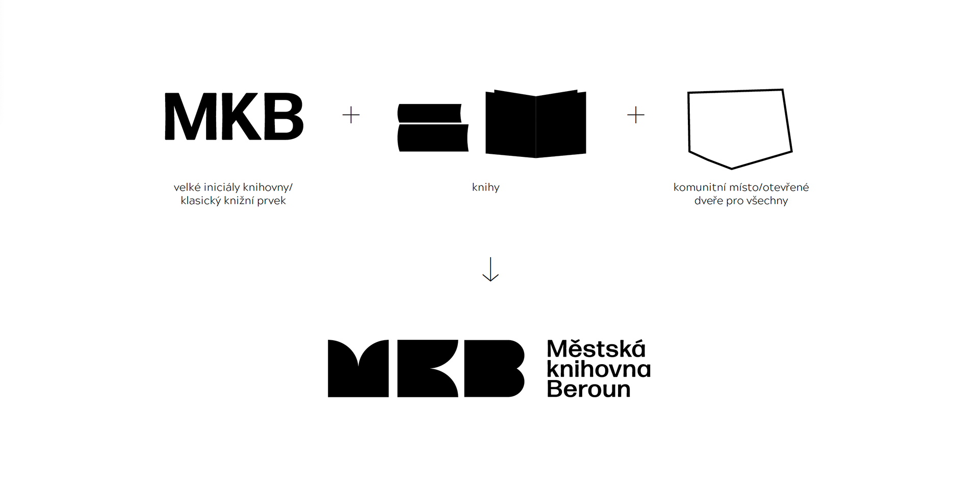
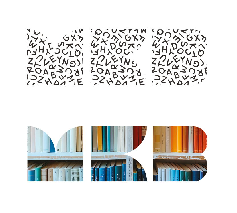
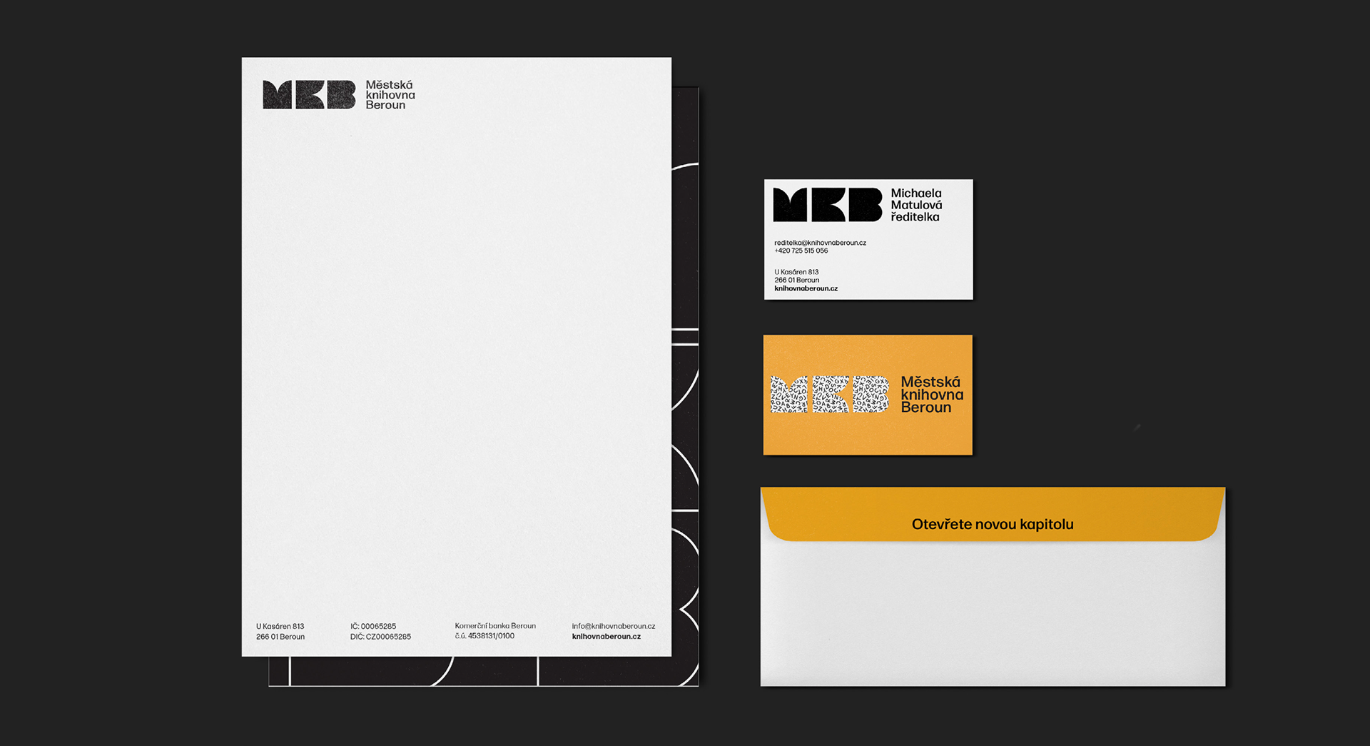
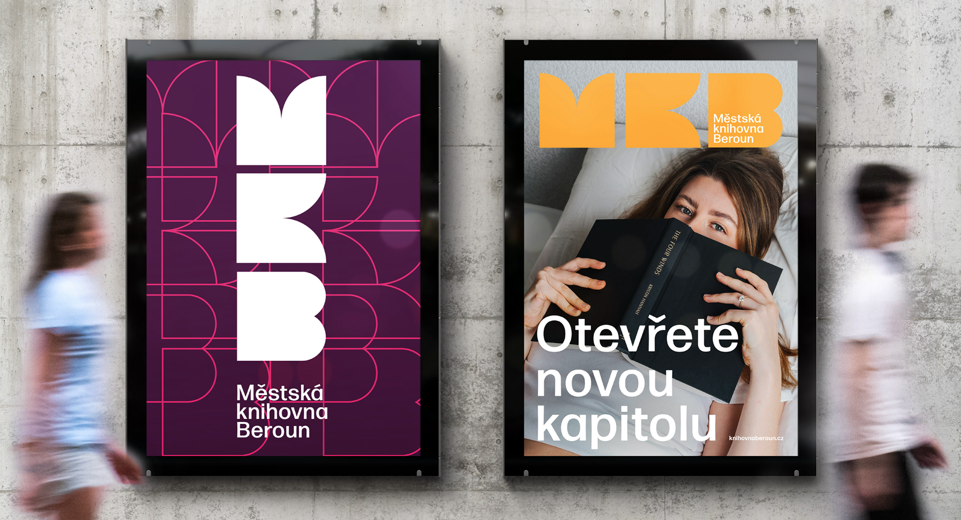
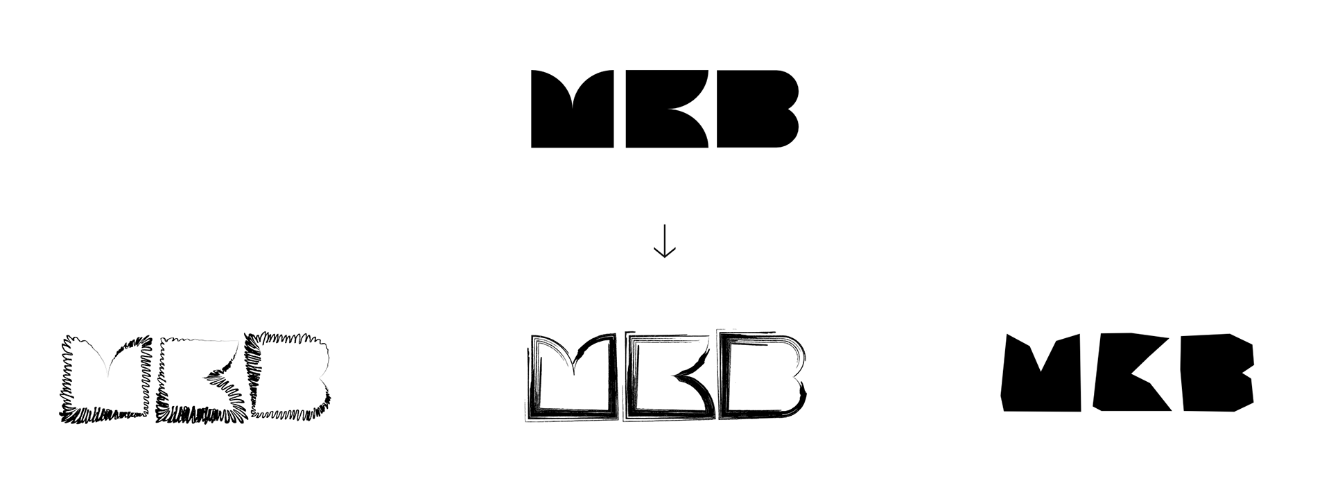
The logotype of the Beroun City Library consists of the three dominant initial letters of the library's name. These letters form a unique symbol that refers to an open book (knowledge and discovery), open doors (the library as a place for everyone regardless of age), and books themselves.


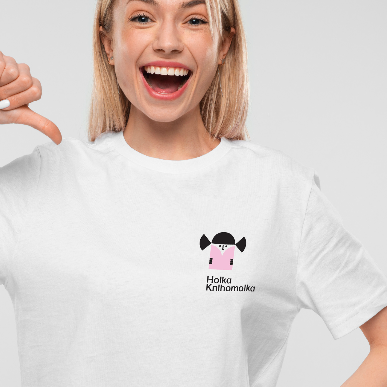
For the purpose of promoting the library’s various accompanying events, a supporting sub-logo was created to represent creative workshops — including creative writing, drawing and painting, and upcycling. The palette of these supporting logos can be further expanded as needed.

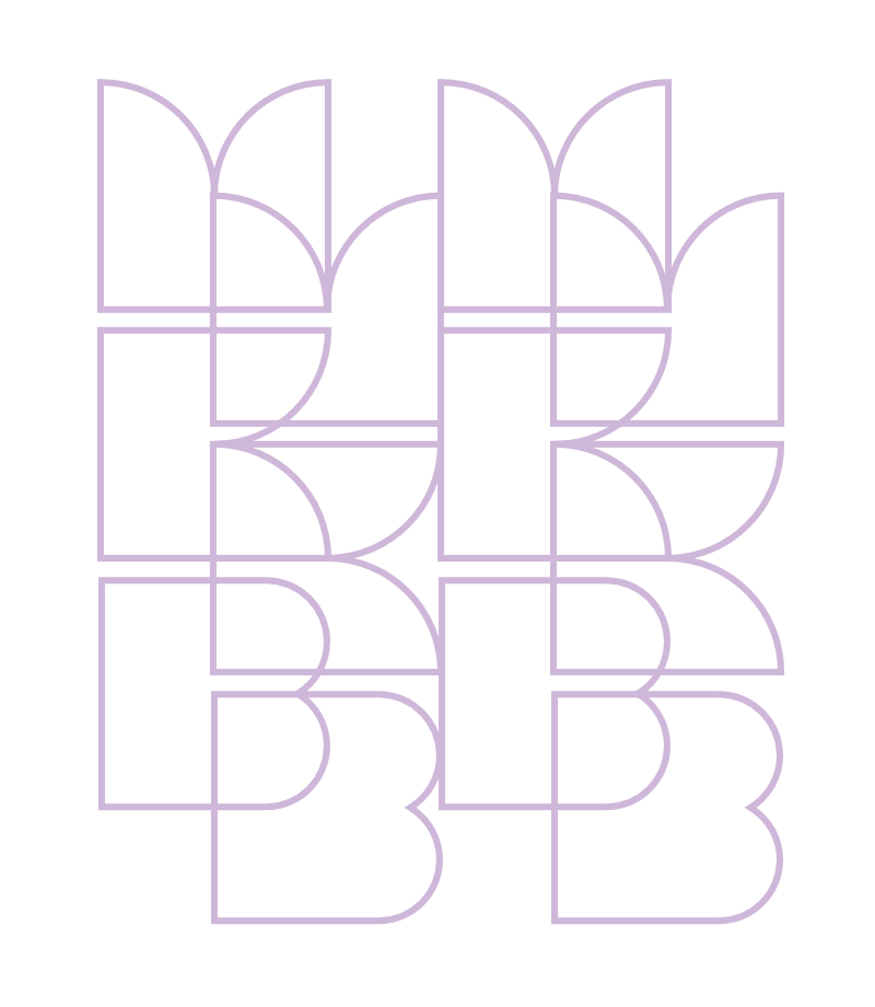
The minimalist logotype can be used as a clipping mask for inserting photos and text. Building on the logotype, a symbol palette was developed for communication on social media and merchandising. The identity is further expanded with a pattern created from the logo symbol.