Litvínov
Client: město Litvínov
Contractor: město Litvínov
Cooperation: Martin Svoboda
Year: 2025
Status: tender, 4-5th place
Type: Visual Identity, Branding, Logo
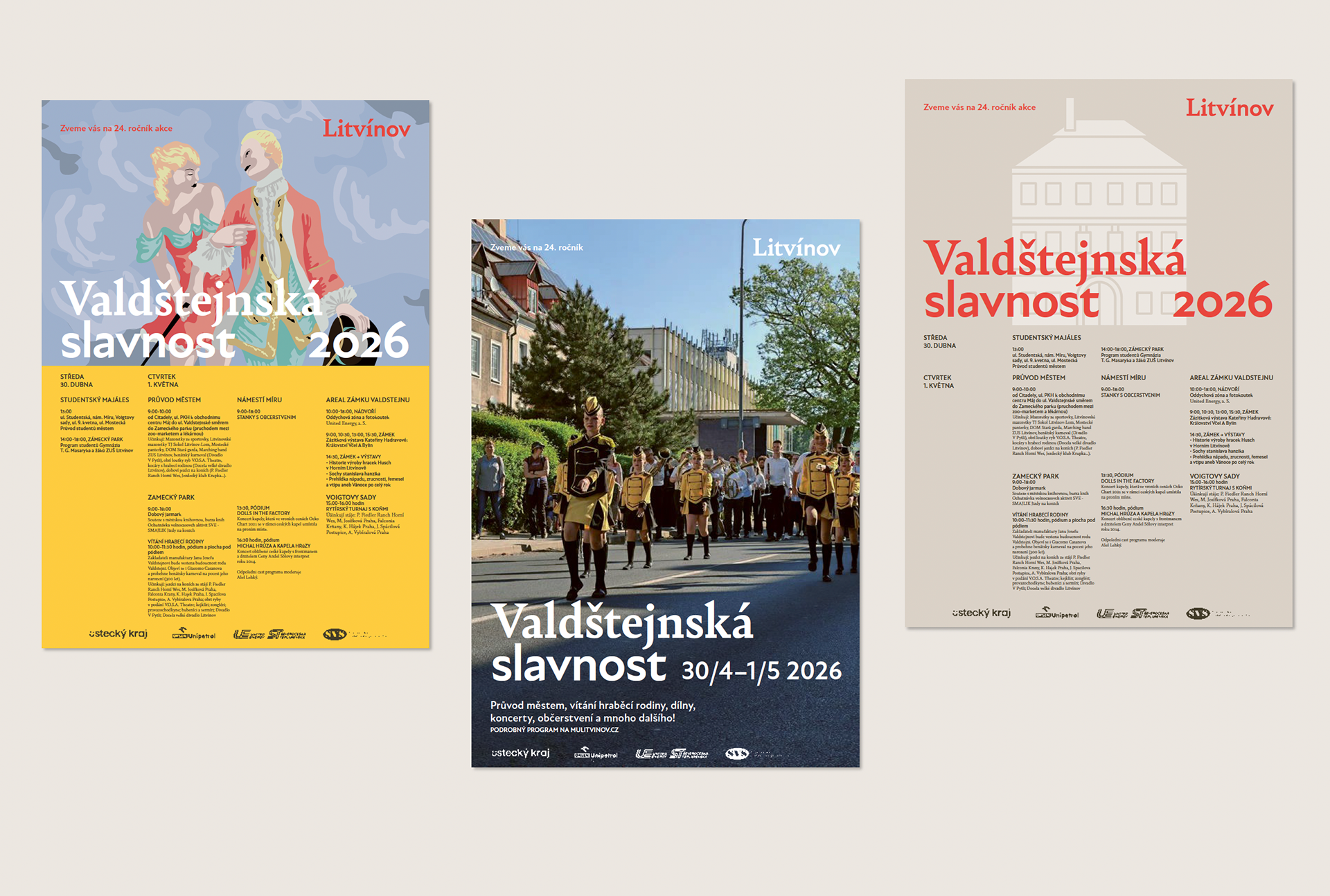
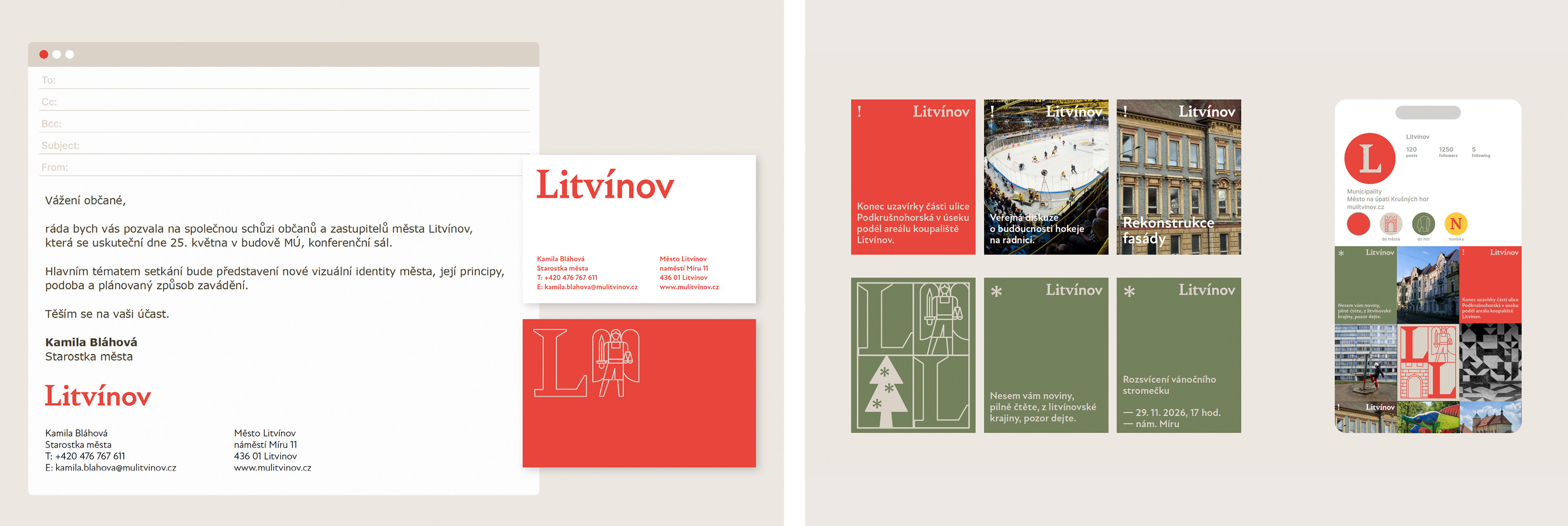
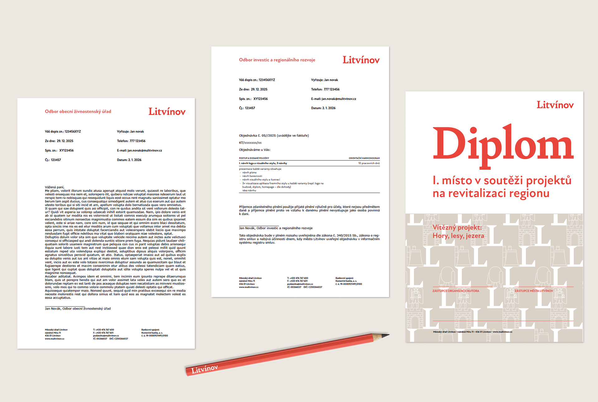
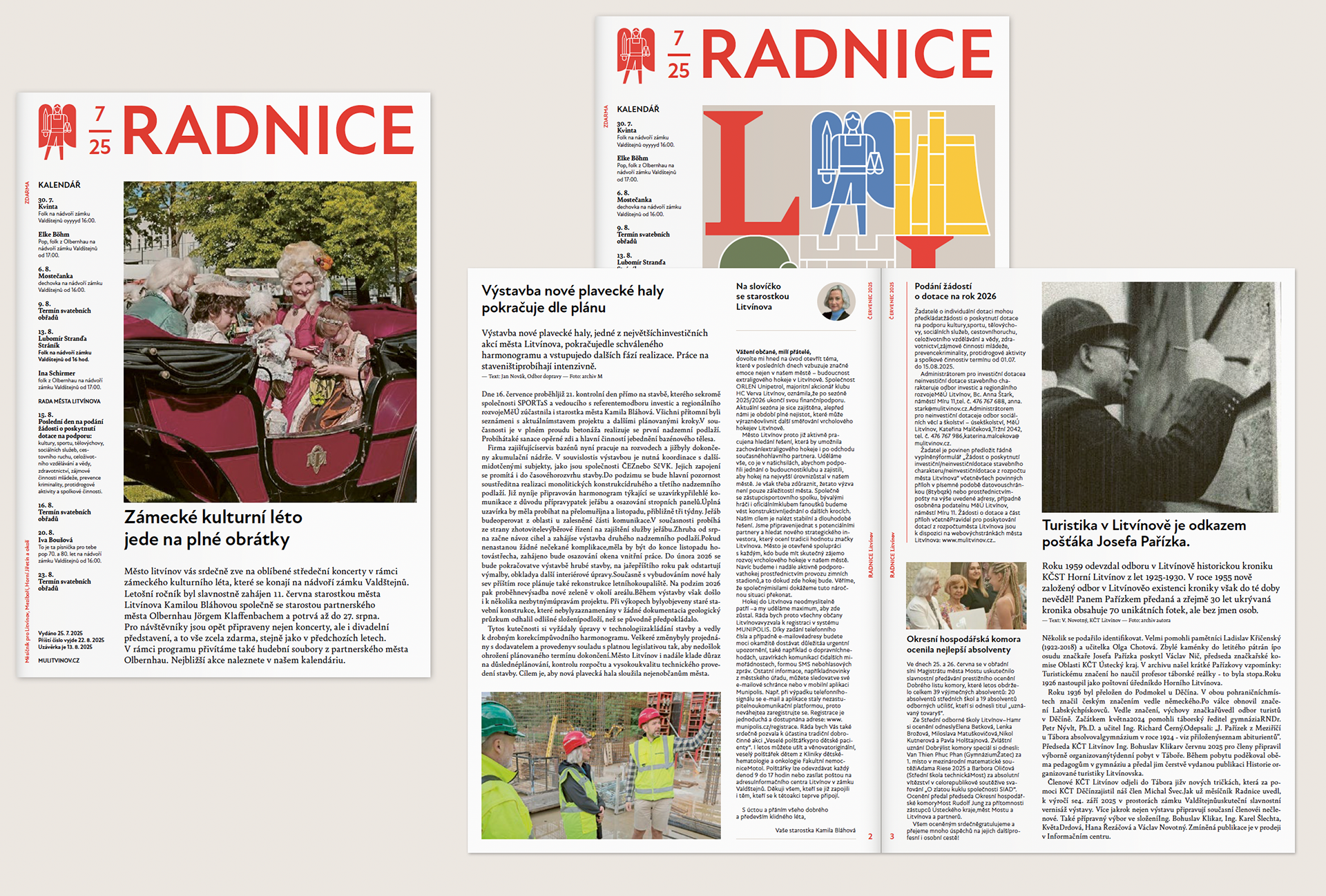
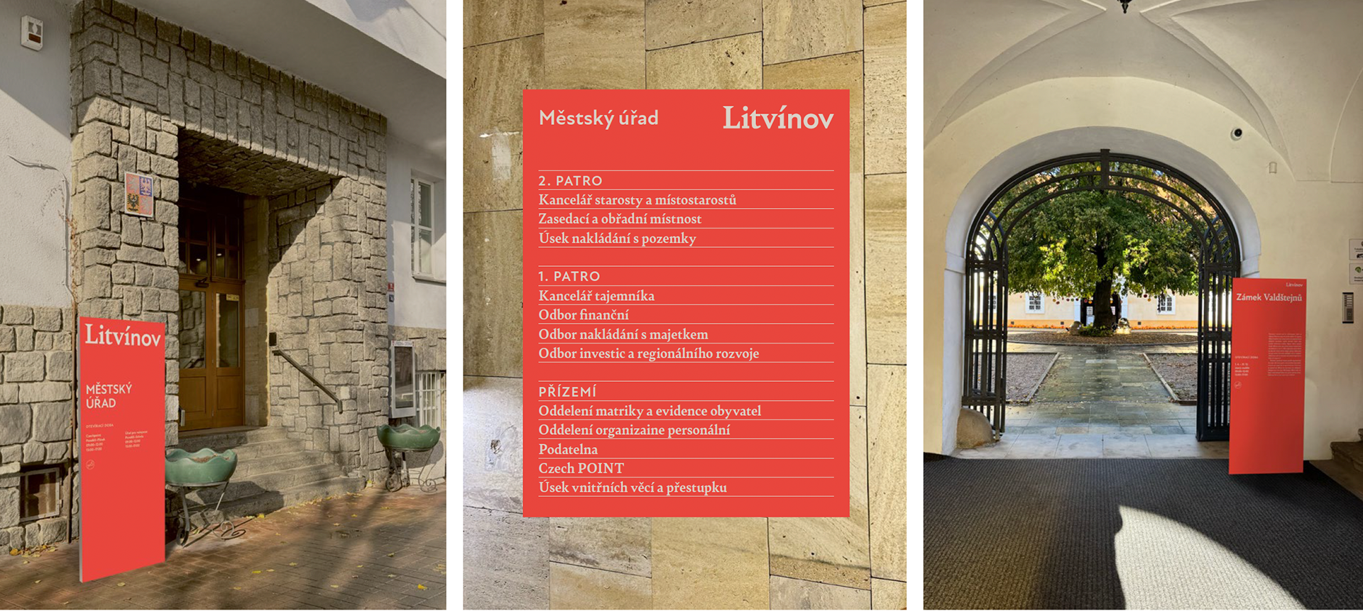
Visual identity for the city of Litvínov, known for its industrial production, deep forests, and aristocratic history. The logo combines the new with the old, nature with industry, entertainment with culture.
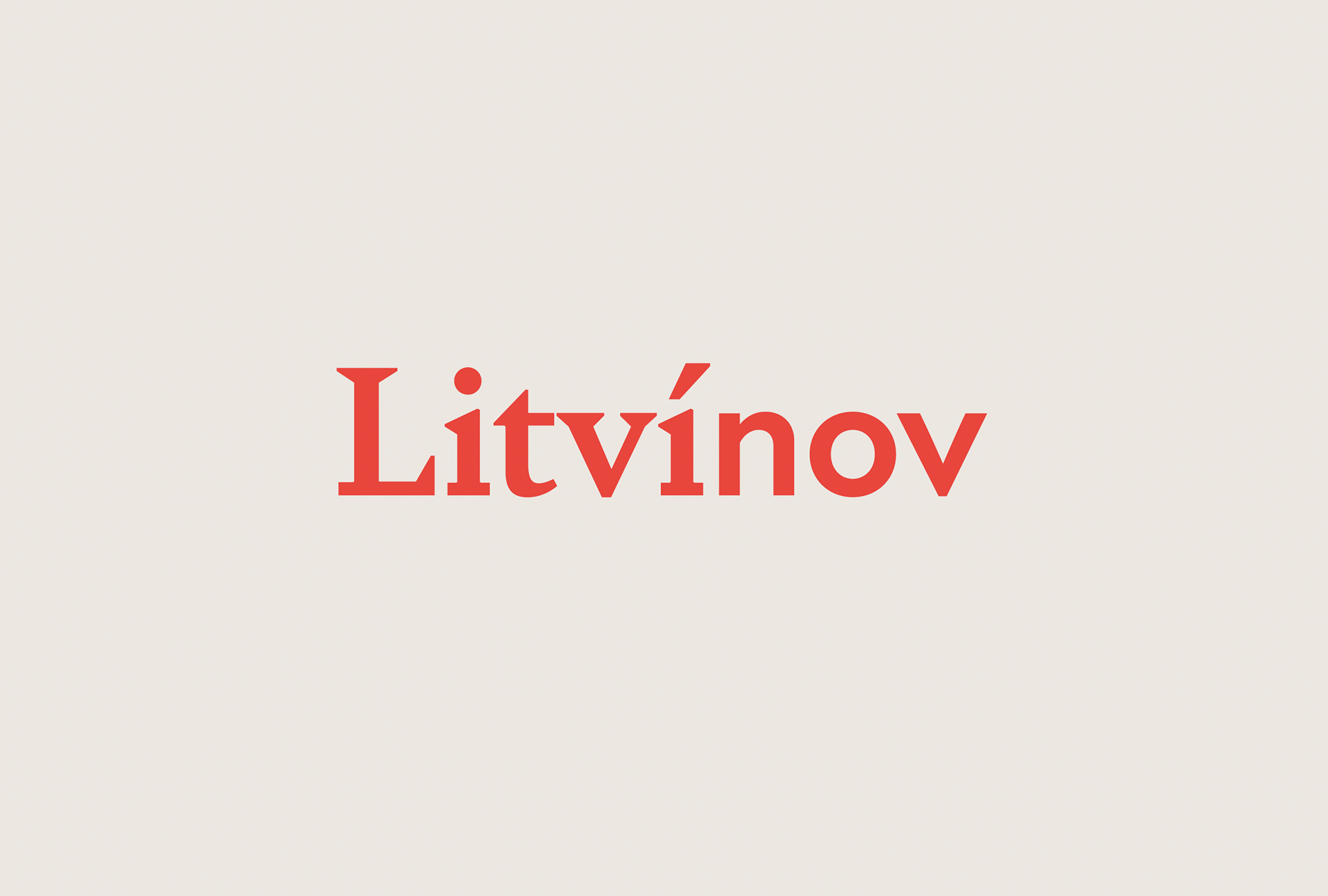
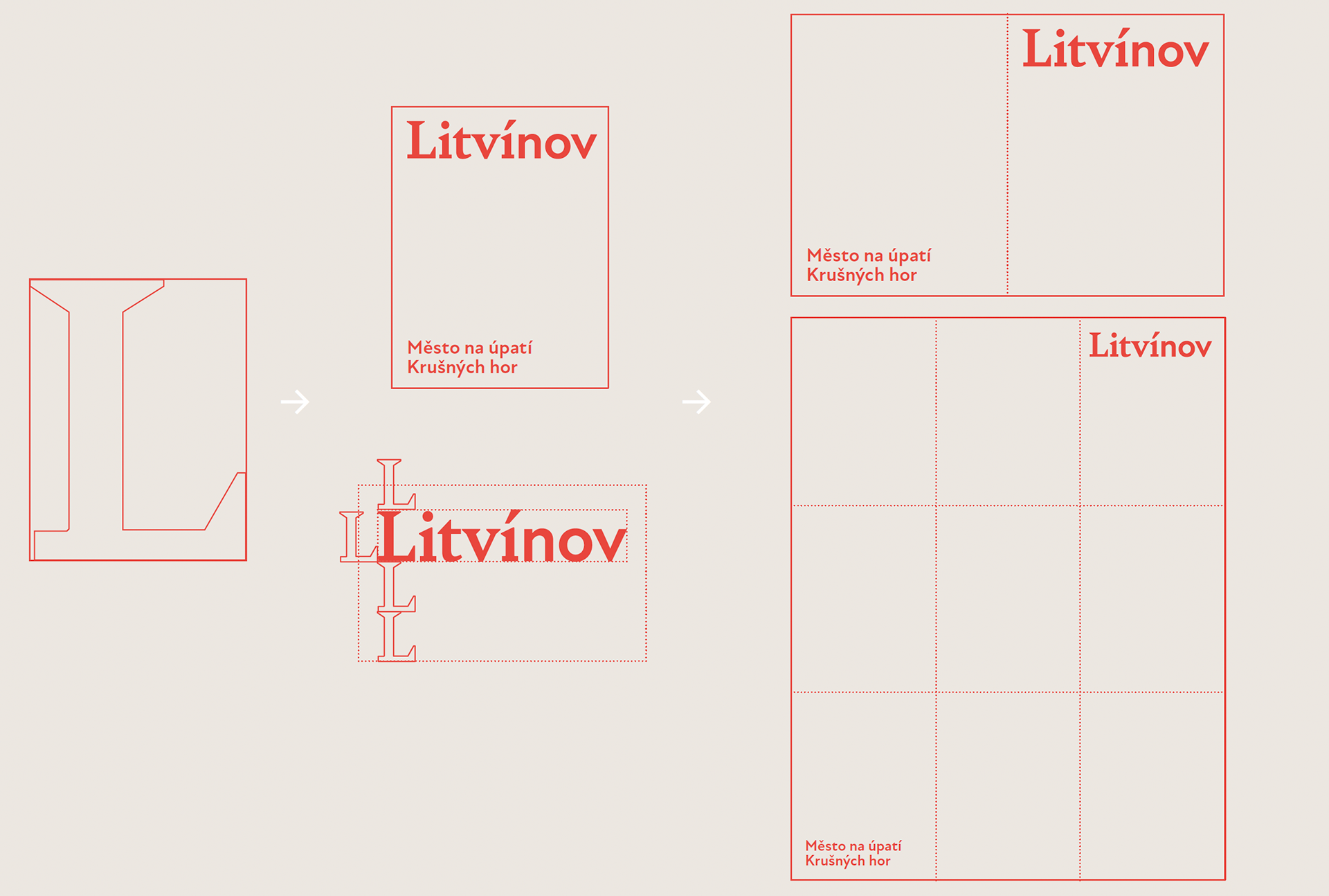
The graphic concept is based on a combination of serif and sans serif fonts. The name of the city thus graphically combines history with the modern direction of the city. The Bely Bold title font is characterized by its sharp cuts, which visually tie in with Sýkora's work and can be seen throughout the city. The serif font is complemented by the sans serif font New Atten Bold, which is similar in structure to Bely Bold but has a modern and contemporary feel.
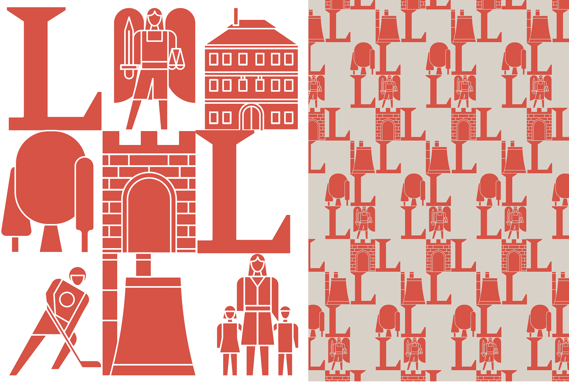
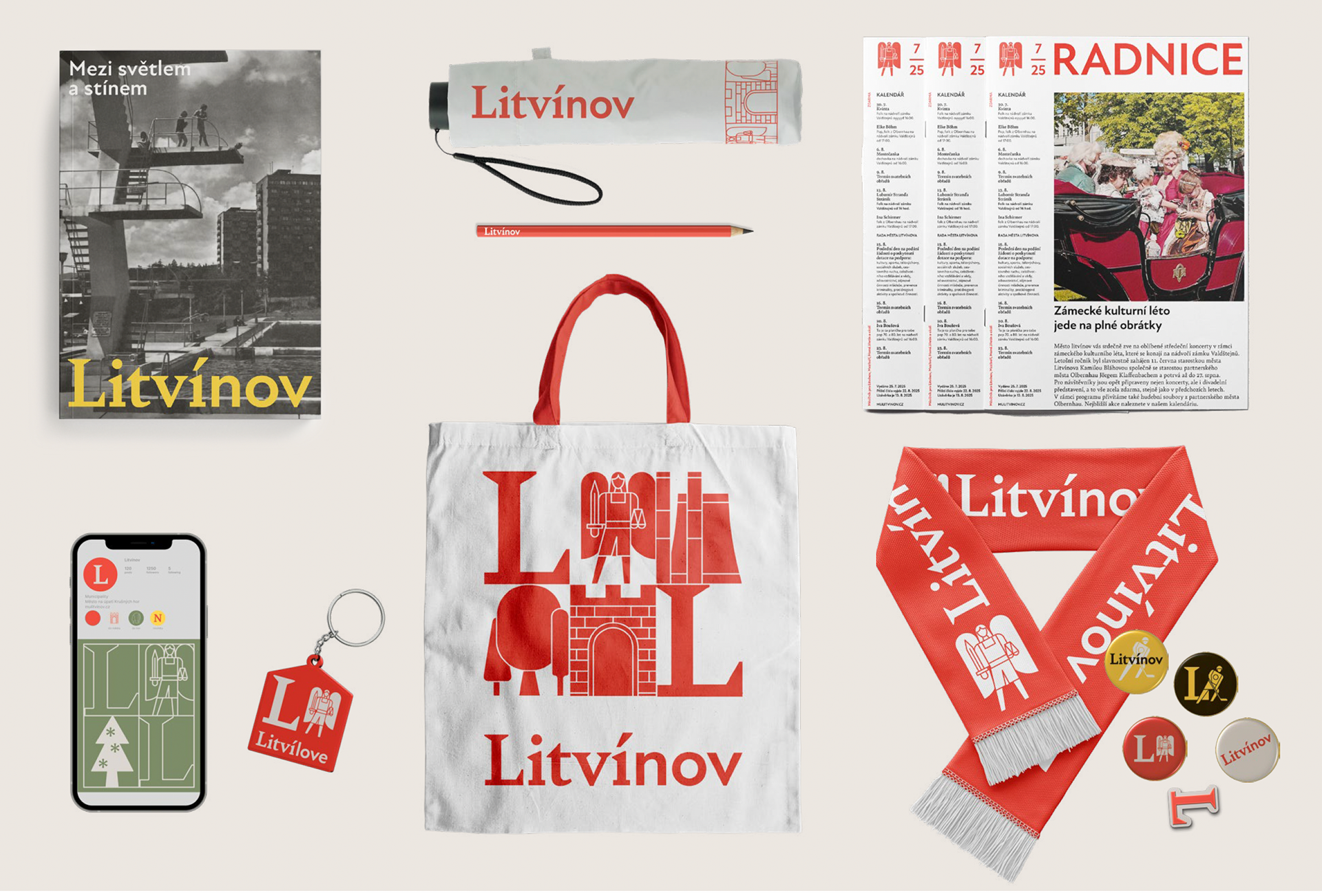
The identity is complemented by a set of illustrations that can be assembled into a pattern. The illustrations graphically follow on from the work of Zdeněk Sýkora and represent the fundamental pillars of the town of Litvínov.
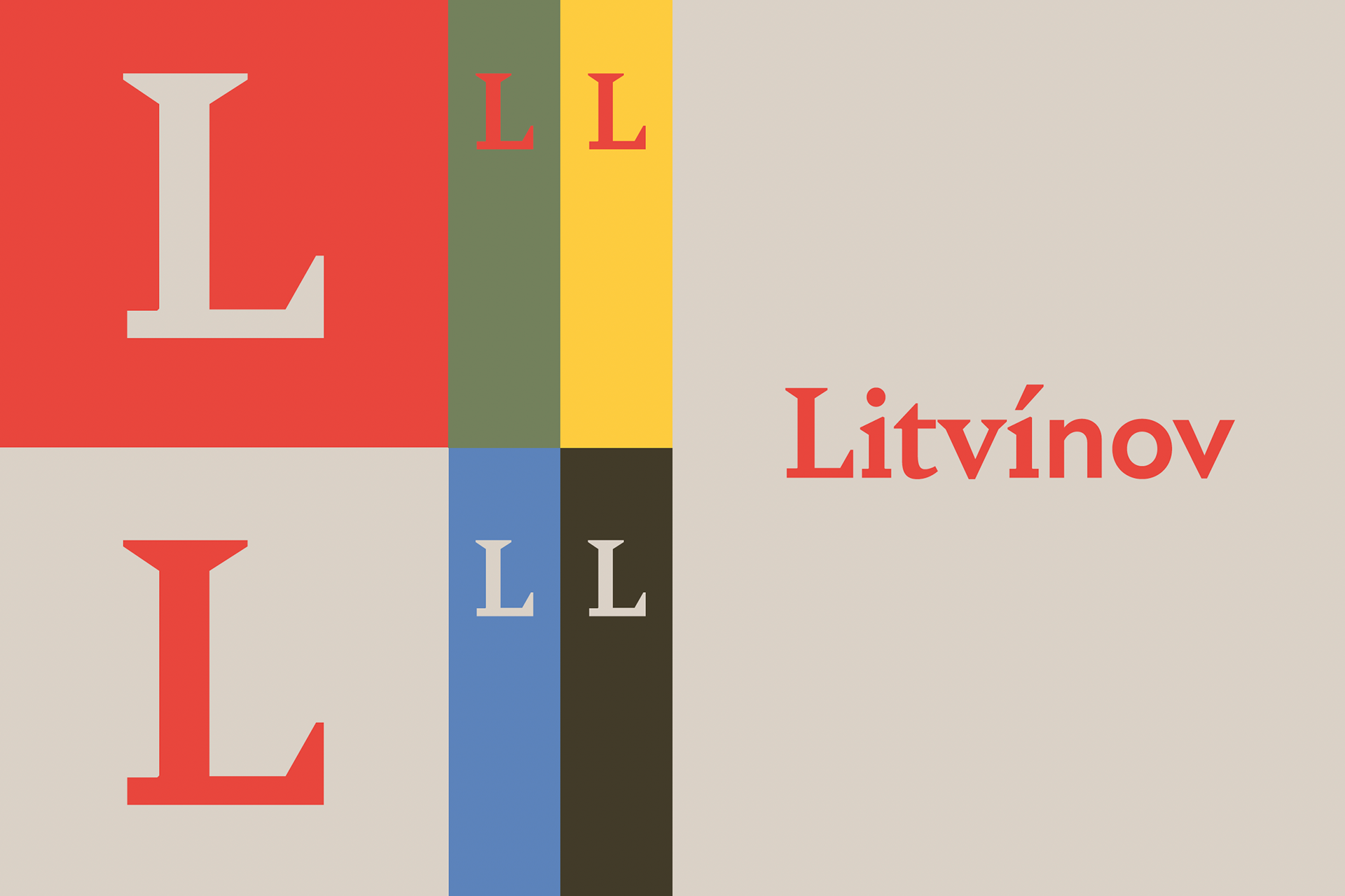
The basic color scheme of the logo follows the color scheme of the city's coat of arms, with brick red as the dominant color. This is complemented by a secondary palette of colors representing the activities and services available in the city.