kolemkolem
Client: KOLEMKOLEM z. s.
Contractor: KOLEMKOLEM z. s.
Cooperation: Martin Svoboda
Photos: KOLEMKOLEM z. s.
Year: 2025
Status: completed
Type: Visual Identity, Branding, Logo
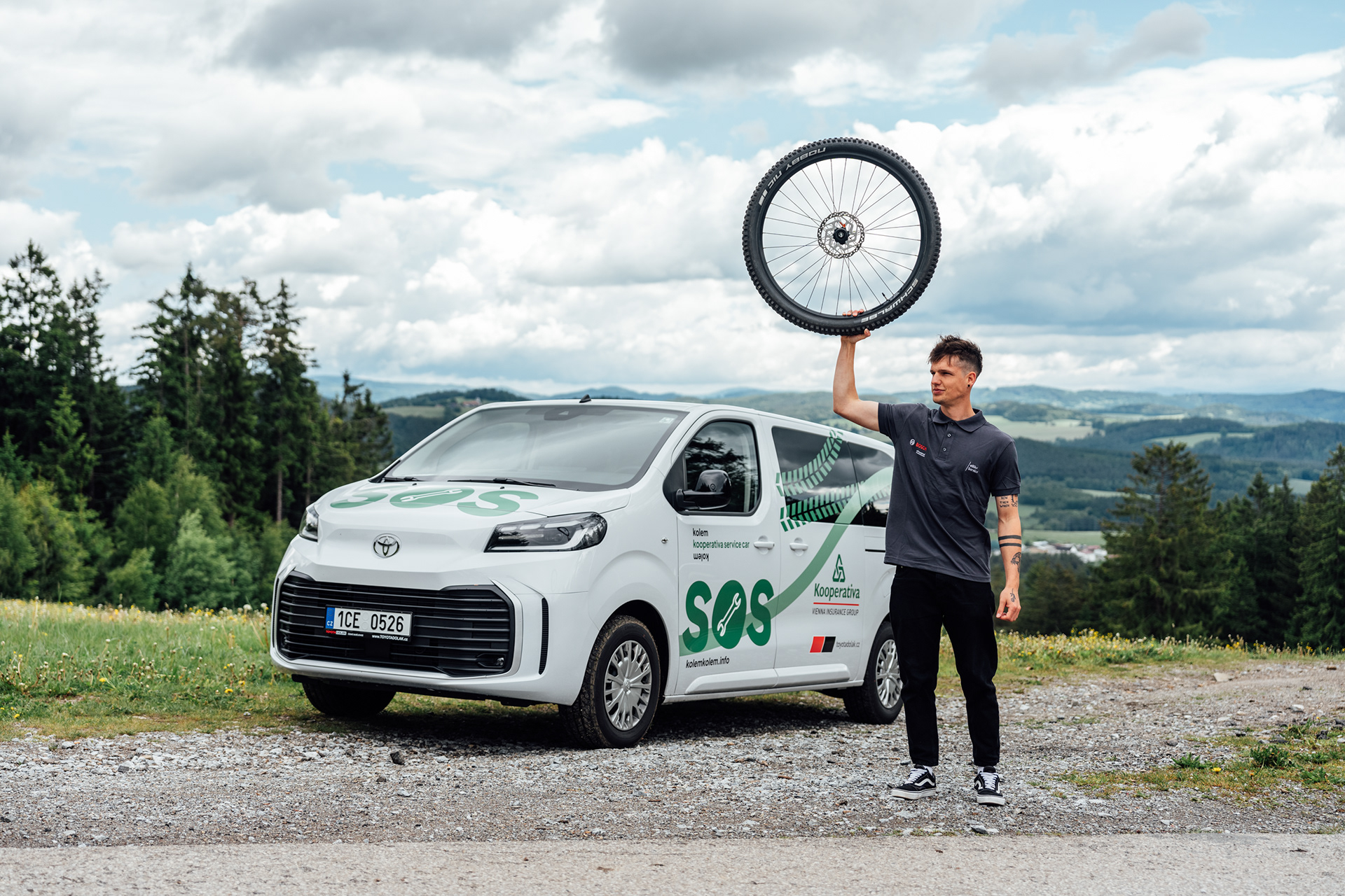
The visual identity of the KolemKolem cycling project is an example of a timeless project with a modest color scheme designed for all cycling enthusiasts. KolemKolem operates in the beautiful countryside around Lipno, and thanks to the project, you can discover new places suitable for all types of bikes. Using the planner, you can easily plan a route for families with children as well as for cycling pros.
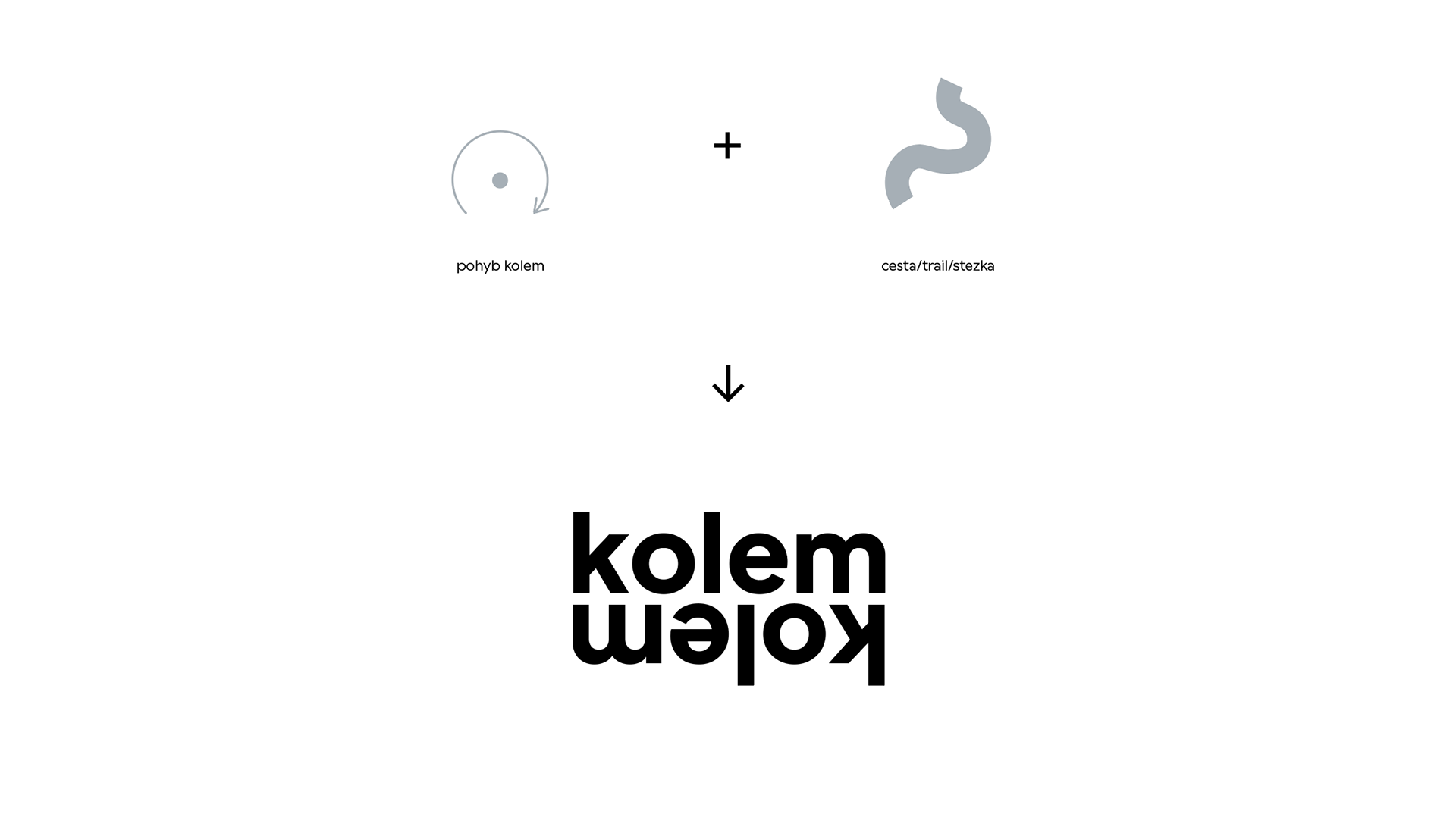
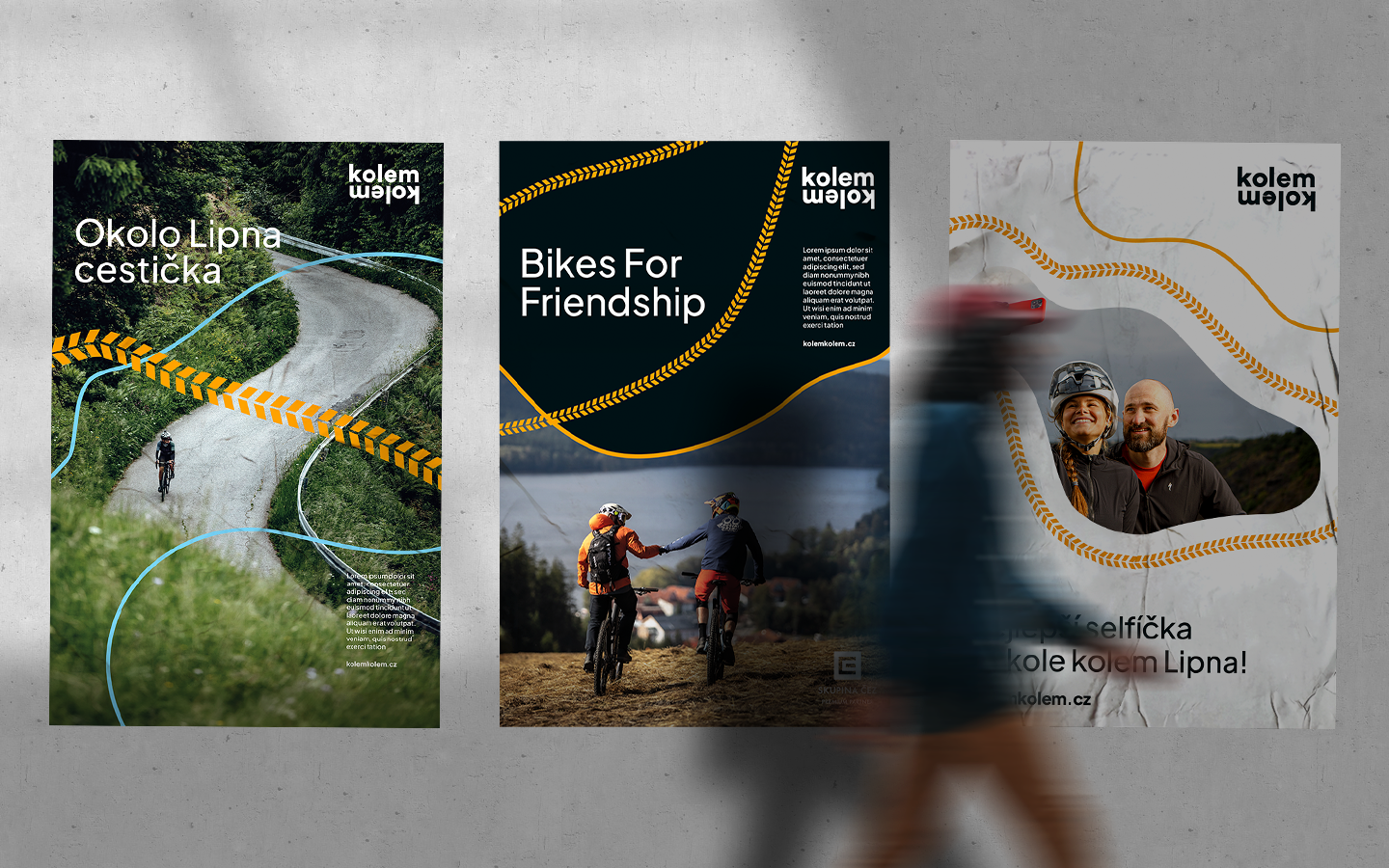
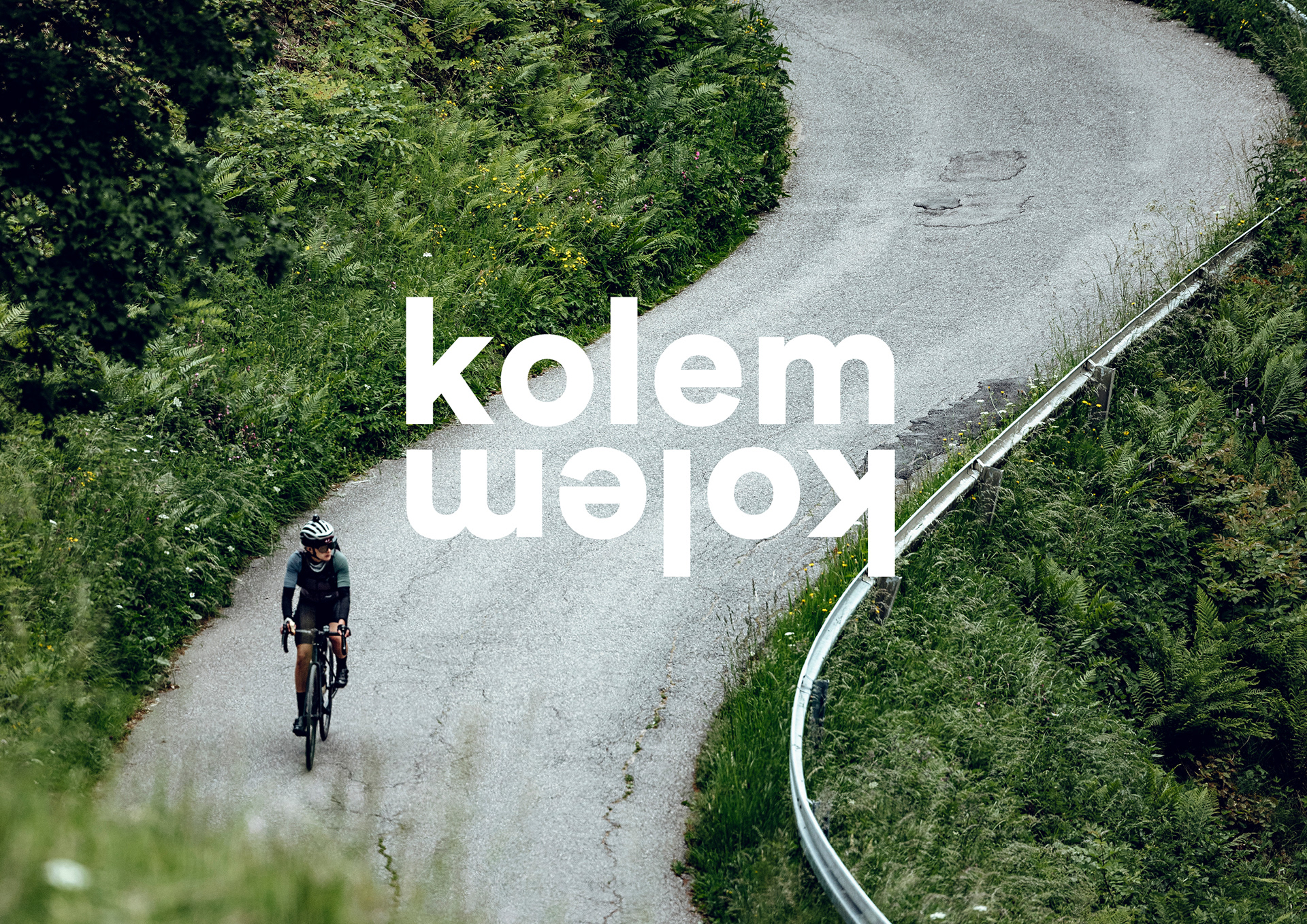
The logotype kolemkolem is based on a play on words in the Czech language – riding a bike, the circular motion of the wheel, and the route around the Lipno Dam.
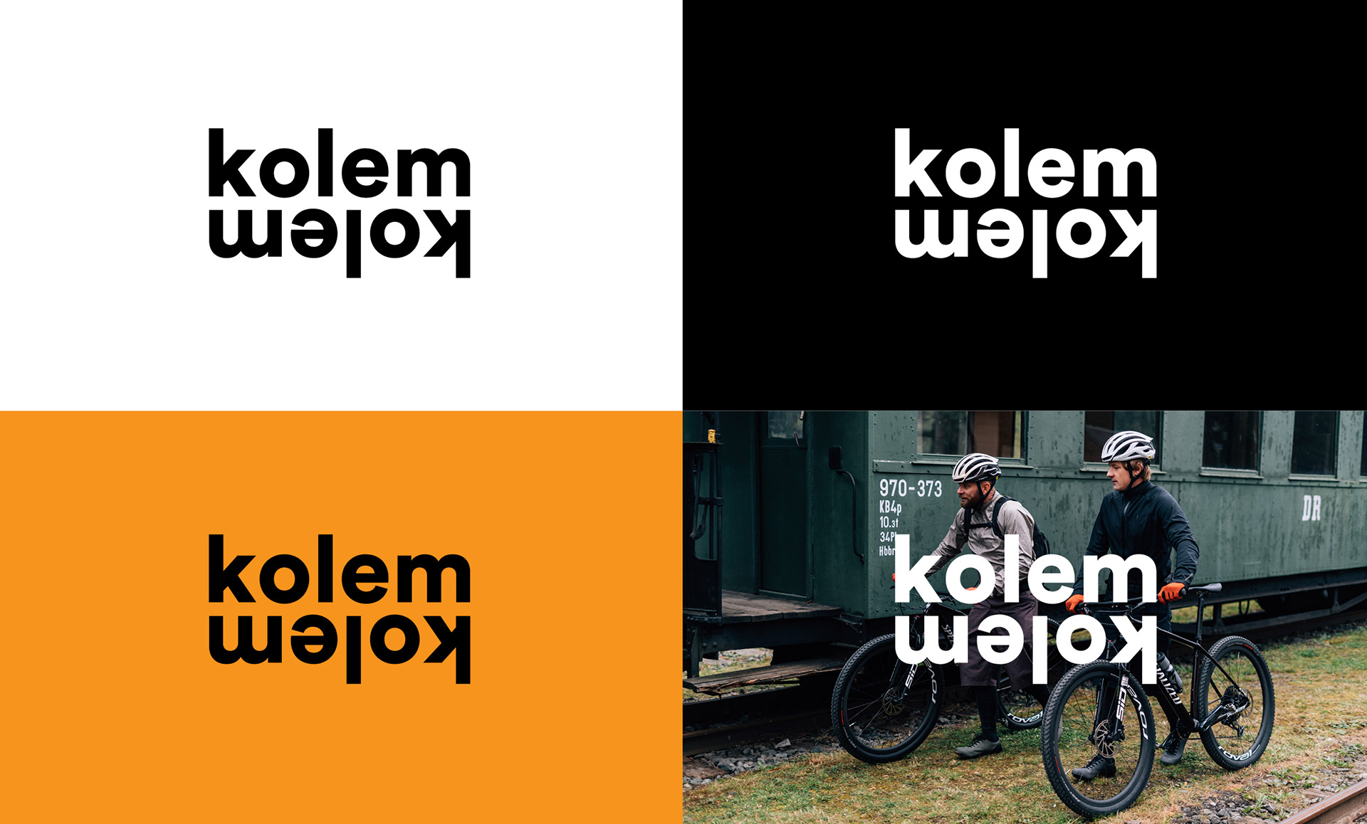
The logotype is set in Plus Jakarta Sans font, which meets all the attributes of a clean, geometric font. The basic color scheme of the visual identity is black and white. It is further complemented by accents of bright colors representing movement on a bike, on foot, and on cross-country skis in winter.
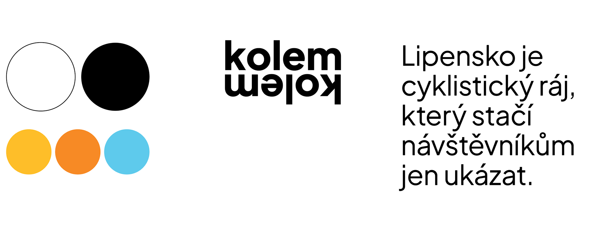
In addition to color codes for different types of transport, individual routes are also shown graphically. A dotted line is used for walking, a tire track is used for cycling, and a solid line is used for winter routes.

The combination of the lines, the characteristic font and the unique colour scheme creates a variable palette of memorable elements that we can easily use in both online and offline environments. The lines also subtly blend into the photos, giving them a playful character. The visual identity thus accurately reflects the main characteristics of the sport and its fans.