Dvůr Nordic
Client: Dvůr Nordic
Contractor: Frank Ateliér
Cooperation: Frank Ateliér
Year: 2021
Status: Unrealized
Type: Visual Identity, Branding
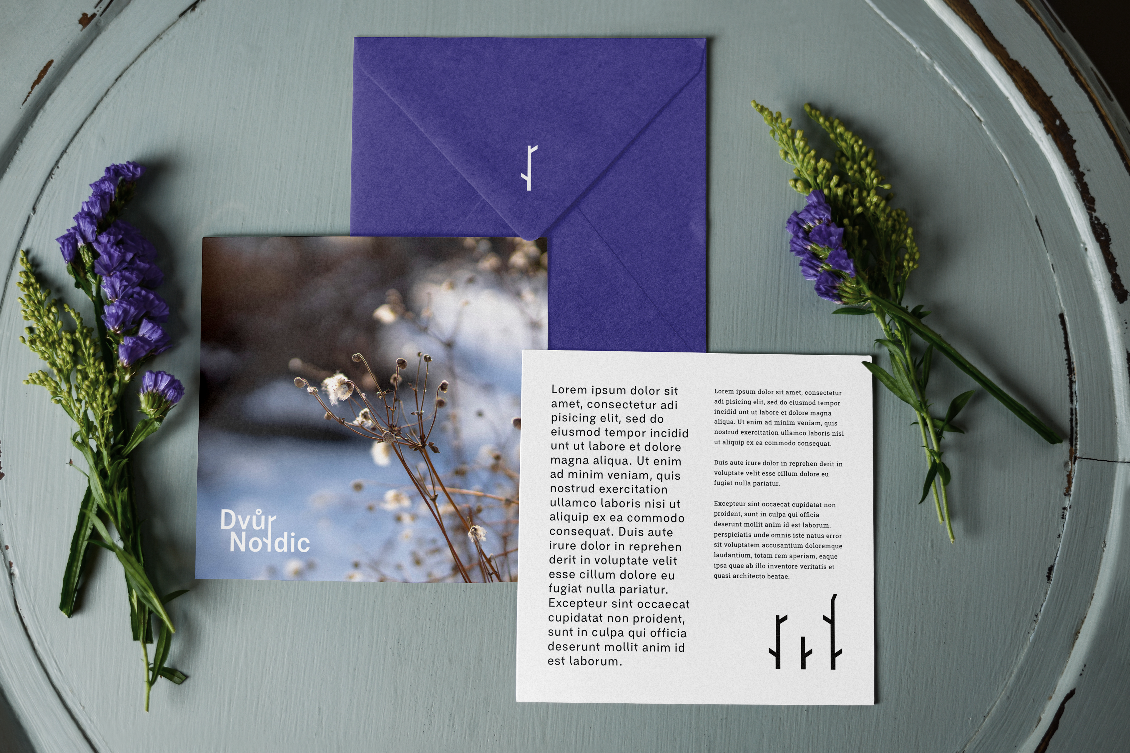
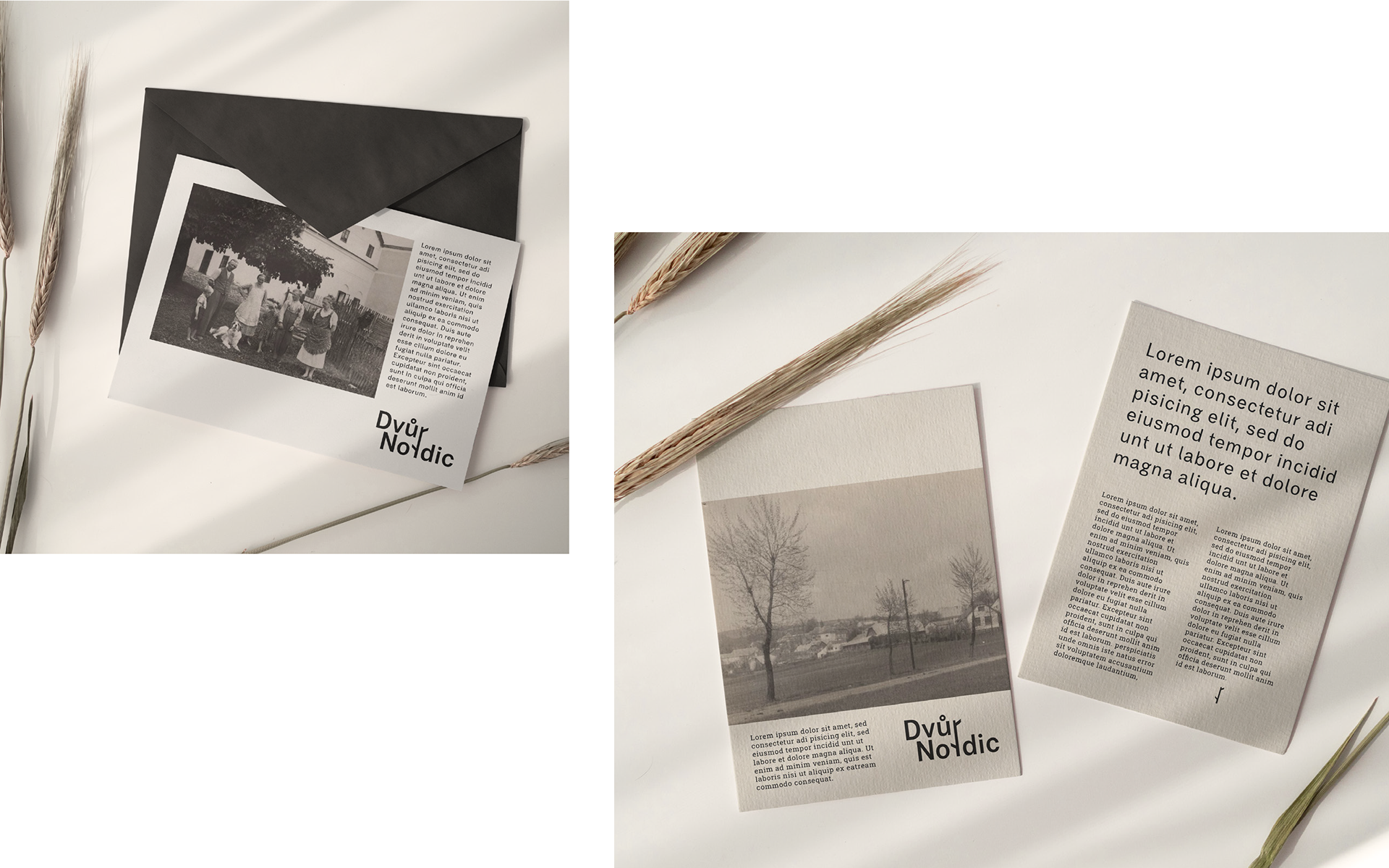
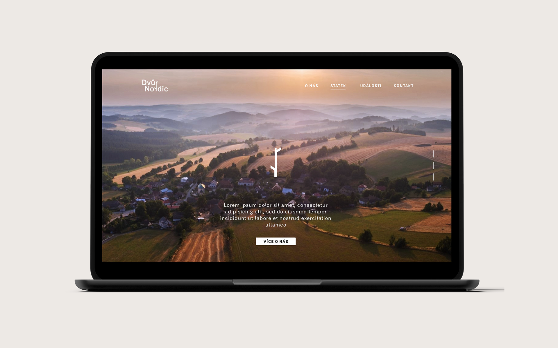
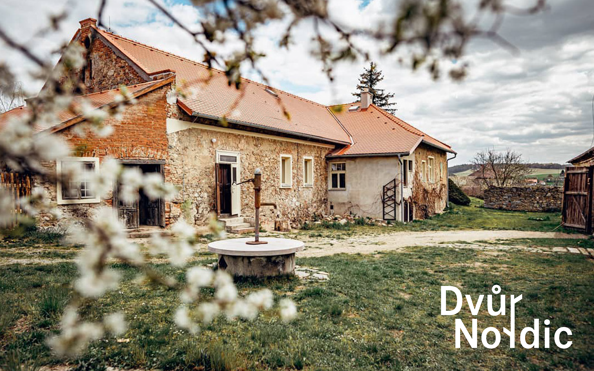
Dvůr Nordic is a rural farmhouse located in the heart of the Highlands. In 2022 it underwent a demanding reconstruction and managed to preserve all the traditional elements of the building and materials. The new farm will serve for weddings, celebrations and recreational purposes.
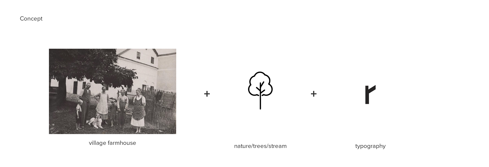
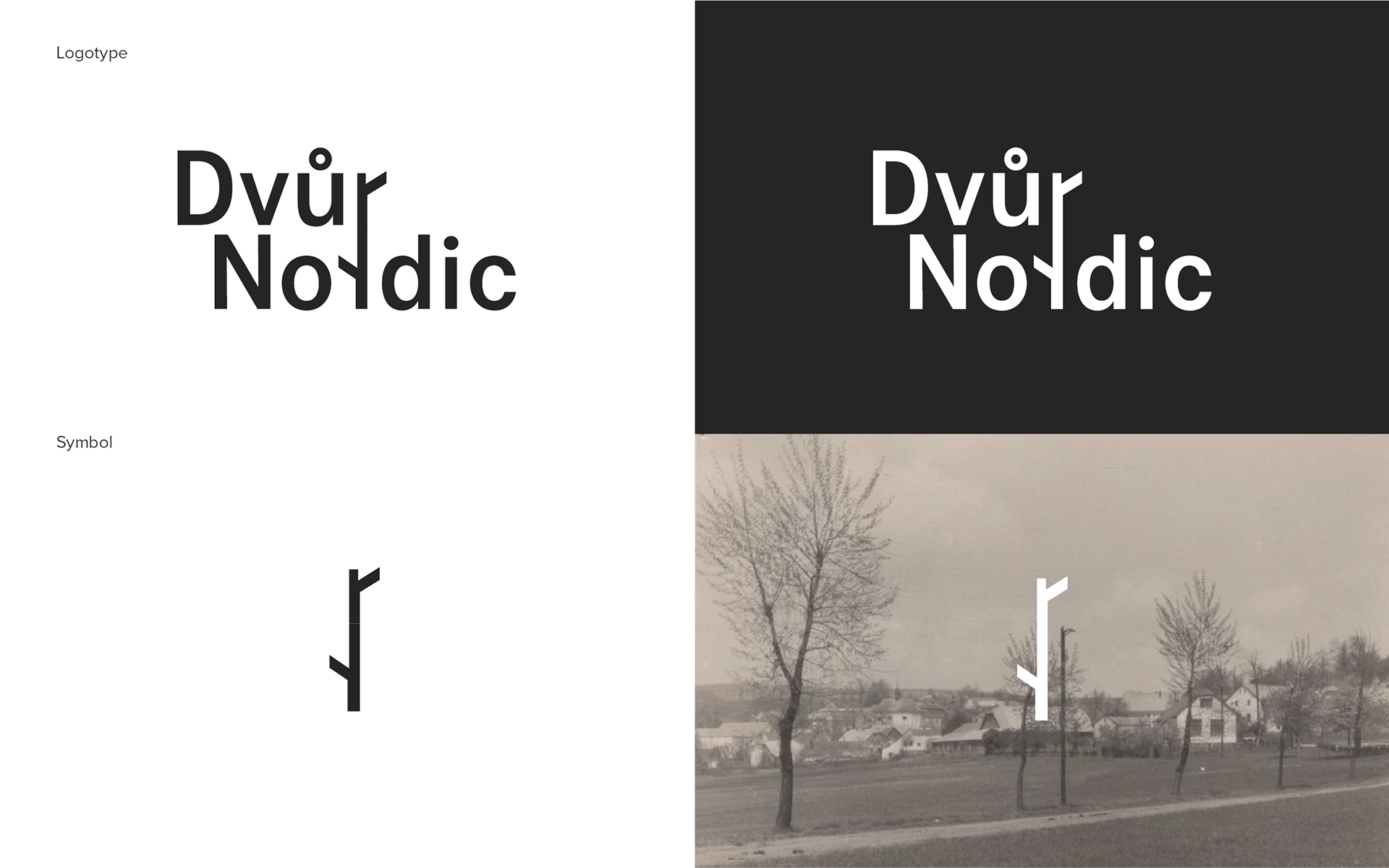
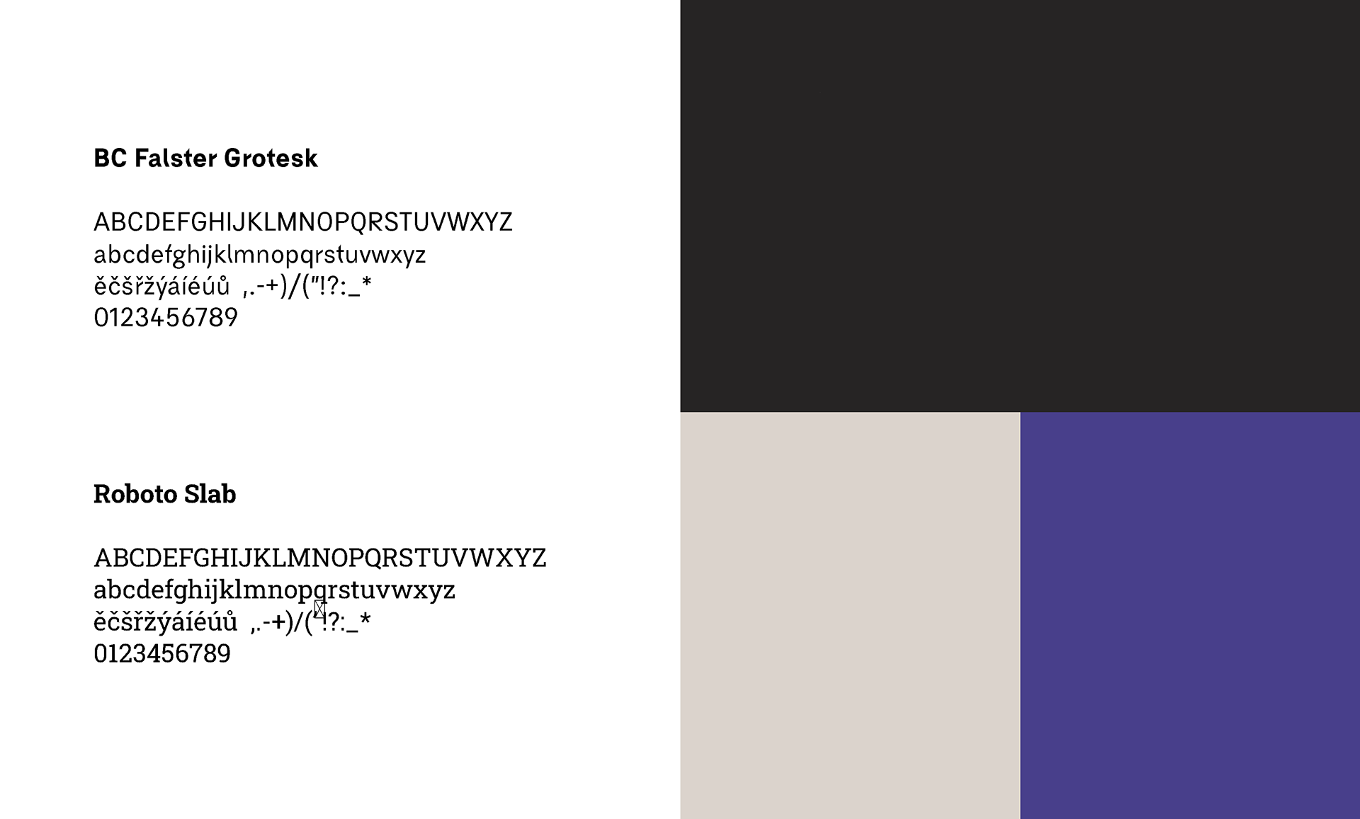
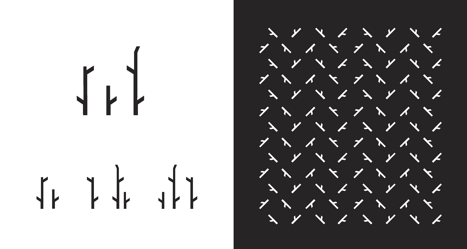
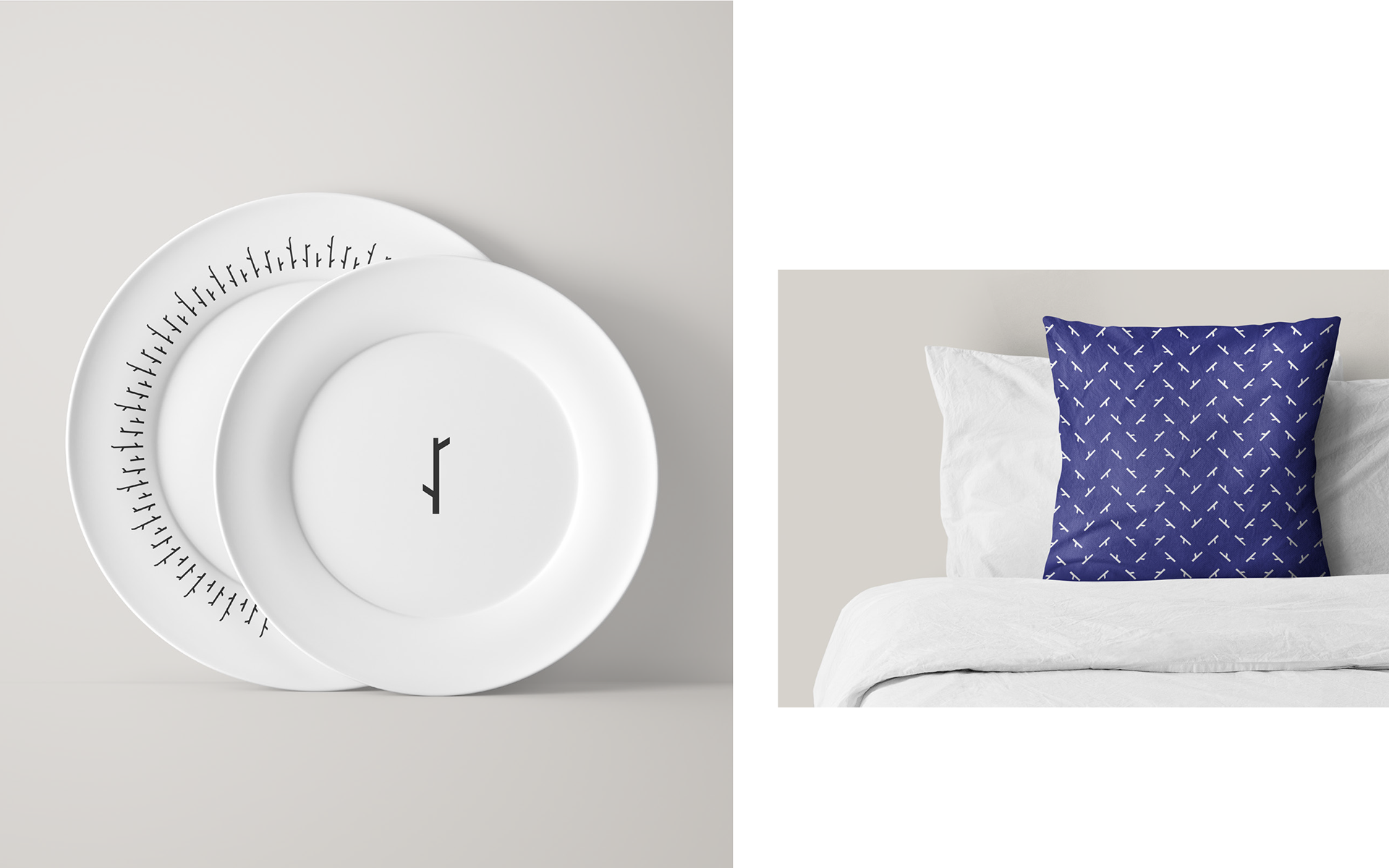
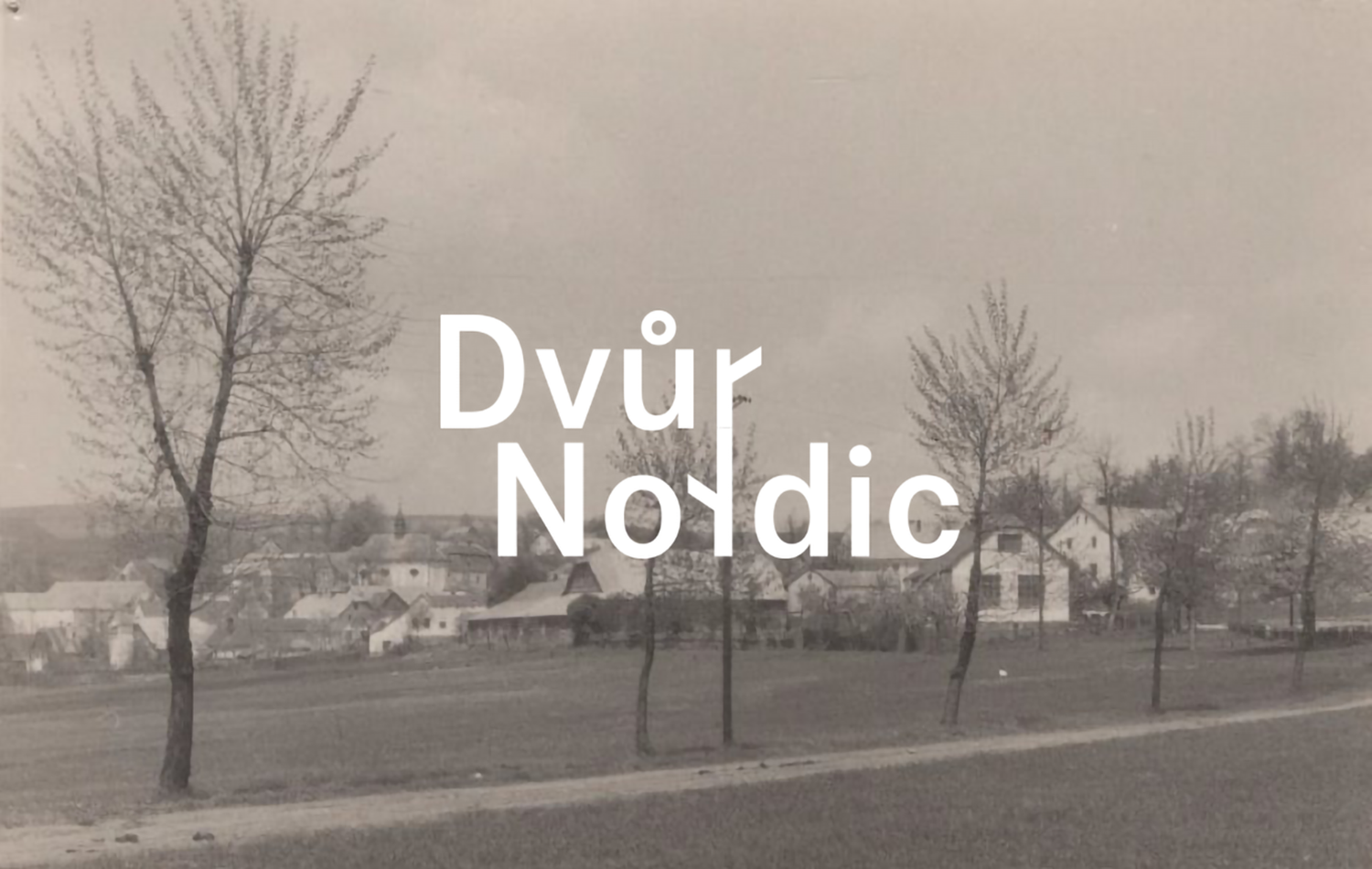
The logotype is inspired by the nature in which the estate is located. Combining the font BC Falster Grotesk and the basic ideas of connection with nature creates a typographic pun. Reflected letter "r" forms a symbol of a twig. The simplicity and cleanliness of the design refers to the Scandidavian design.