Český biatlon
Client: Český biatlon
Contractor: Český biatlon
Cooperation: Frank Atelier
Year: 2023
Status: Tender - 2nd place
Type: Visual Identity, Branding
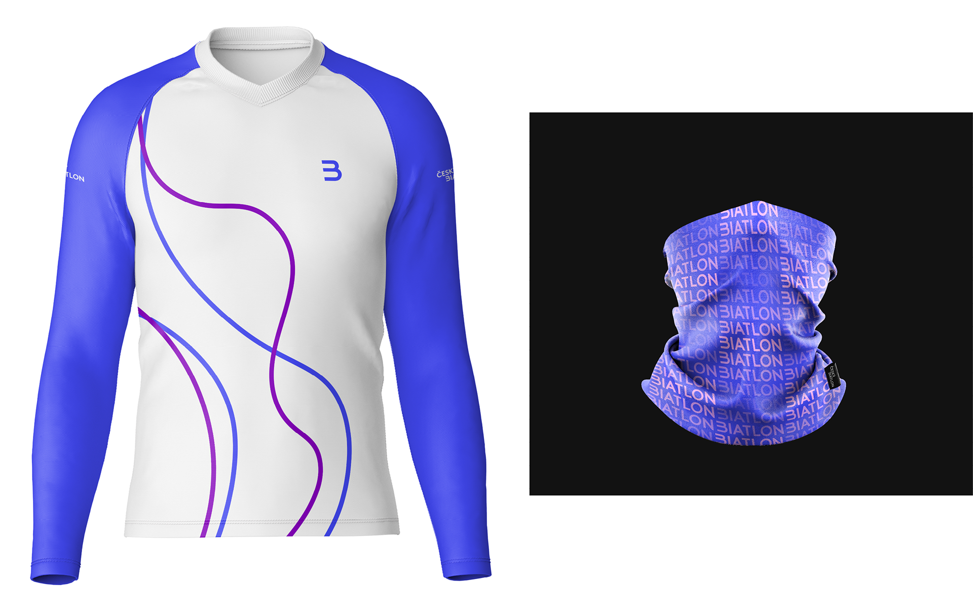
Biathlon is a separate sport with six disciplines, which differ in the length of the course and the number of shooting items. It is primarily a winter sport consisting of cross-country skiing and small-bore shooting. However, we can also find summer variants, where cross-country skiing is replaced by cross-country running, mountain biking, cross-country skiing, etc. Seasons aside, the key to all biathlon variations is accurate shooting and fast dynamic movement on a predetermined course. All this information were used as a starting point for the creation of the characteristic B-shaped symbol (like biathlon). We can also see in it a reference to speed, precision shooting, skis and the shape of the race course.
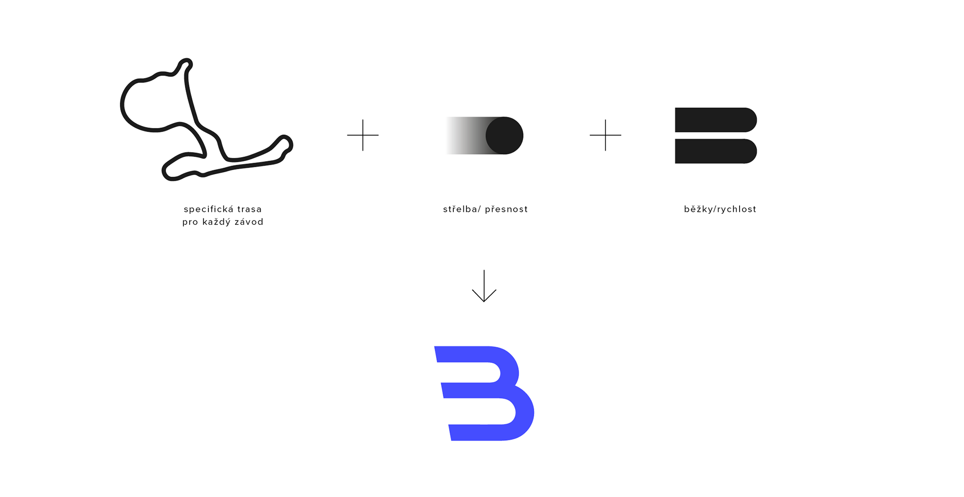
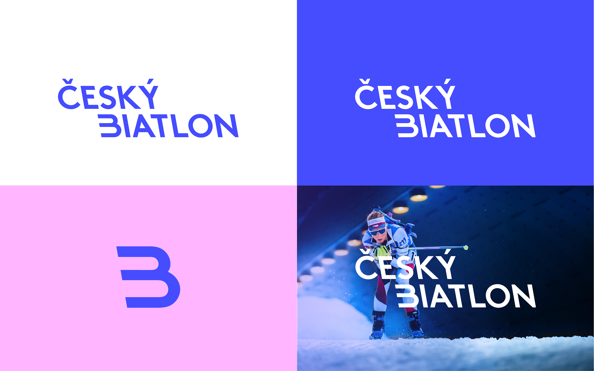
The logotype itself is made of geometric font LL Brown from Czech typeface in reverse italics, which gives the logotype a sporty character.
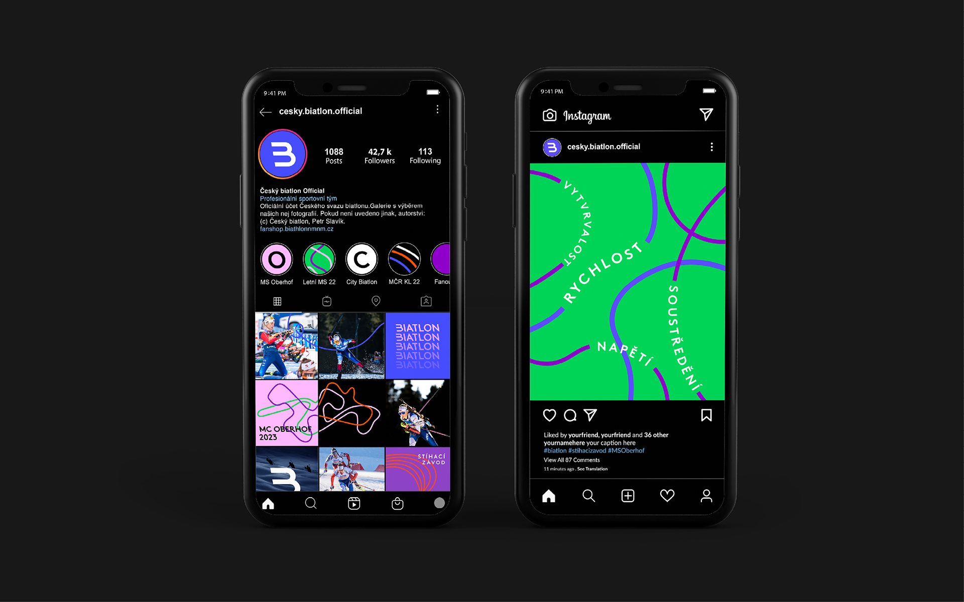
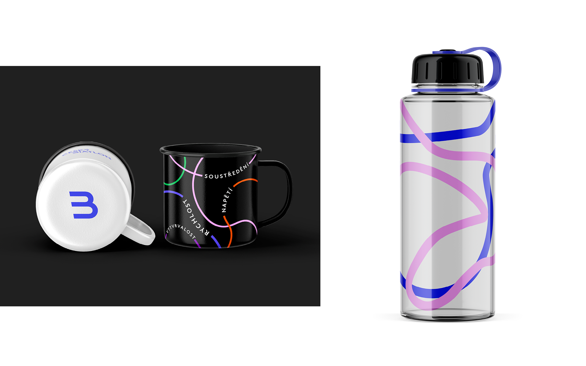
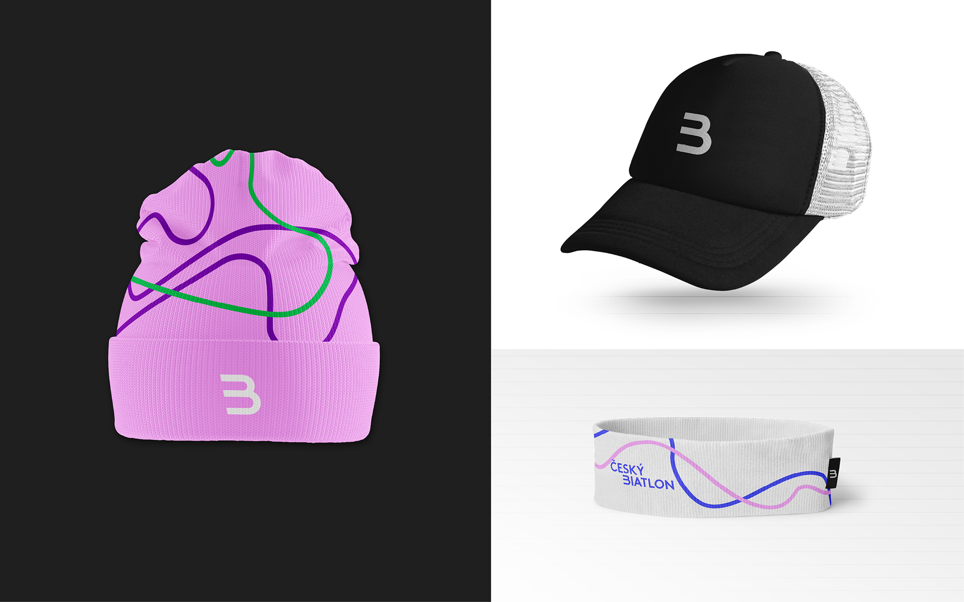
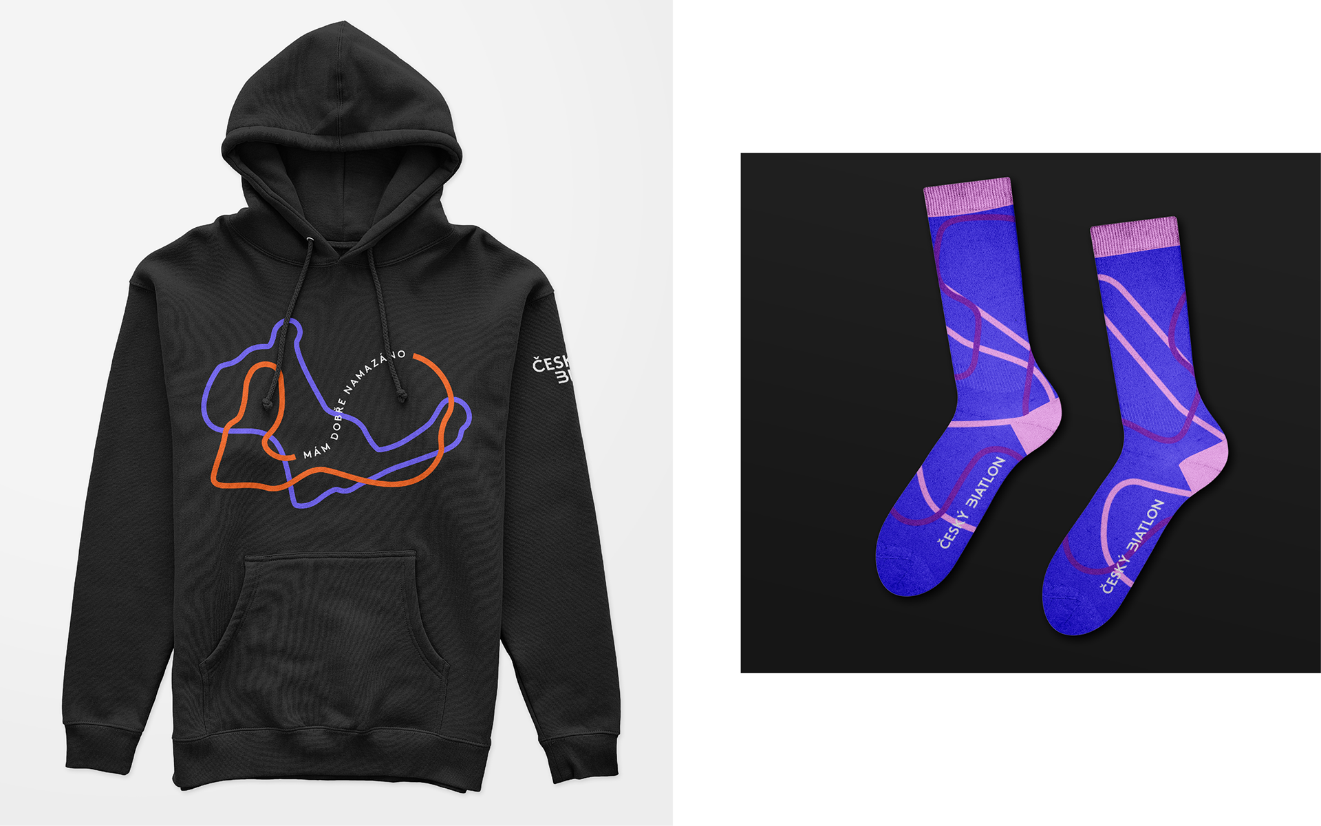
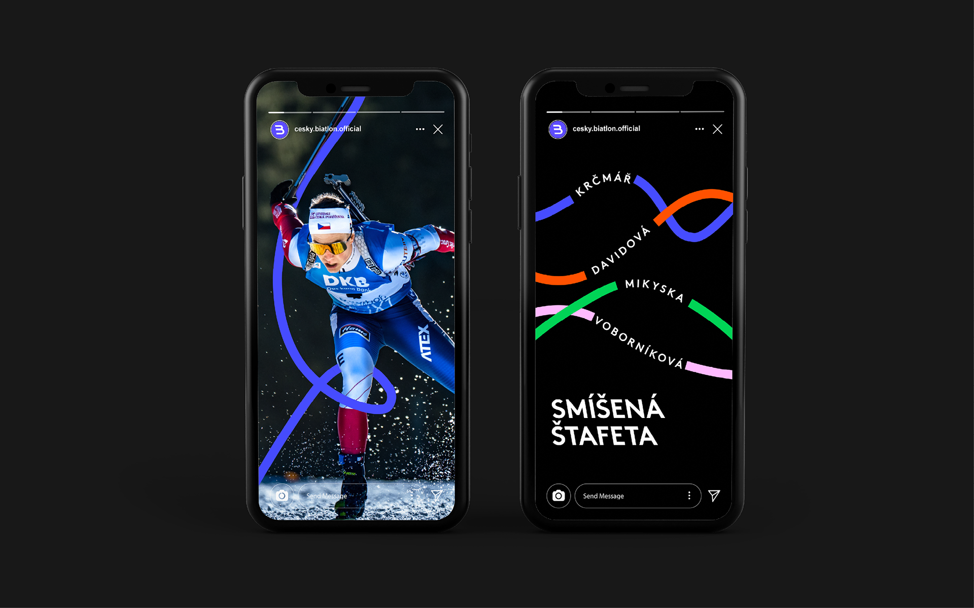
The graphic elements of the identity build on the B symbol and develop it further. Dynamic lines are used to draw the respective race courses. We also use the lines as a distinctive communication element that leads our eyes to the message.
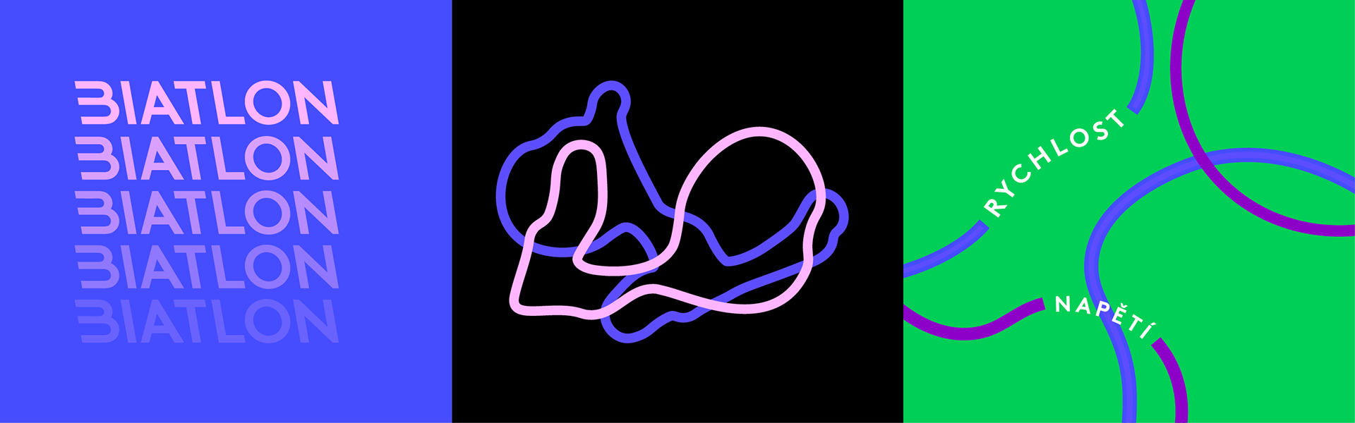
The basic ultramarine light blue is complemented by a palette of bright colours that can be used for alternative forms of biathlon in the summer.
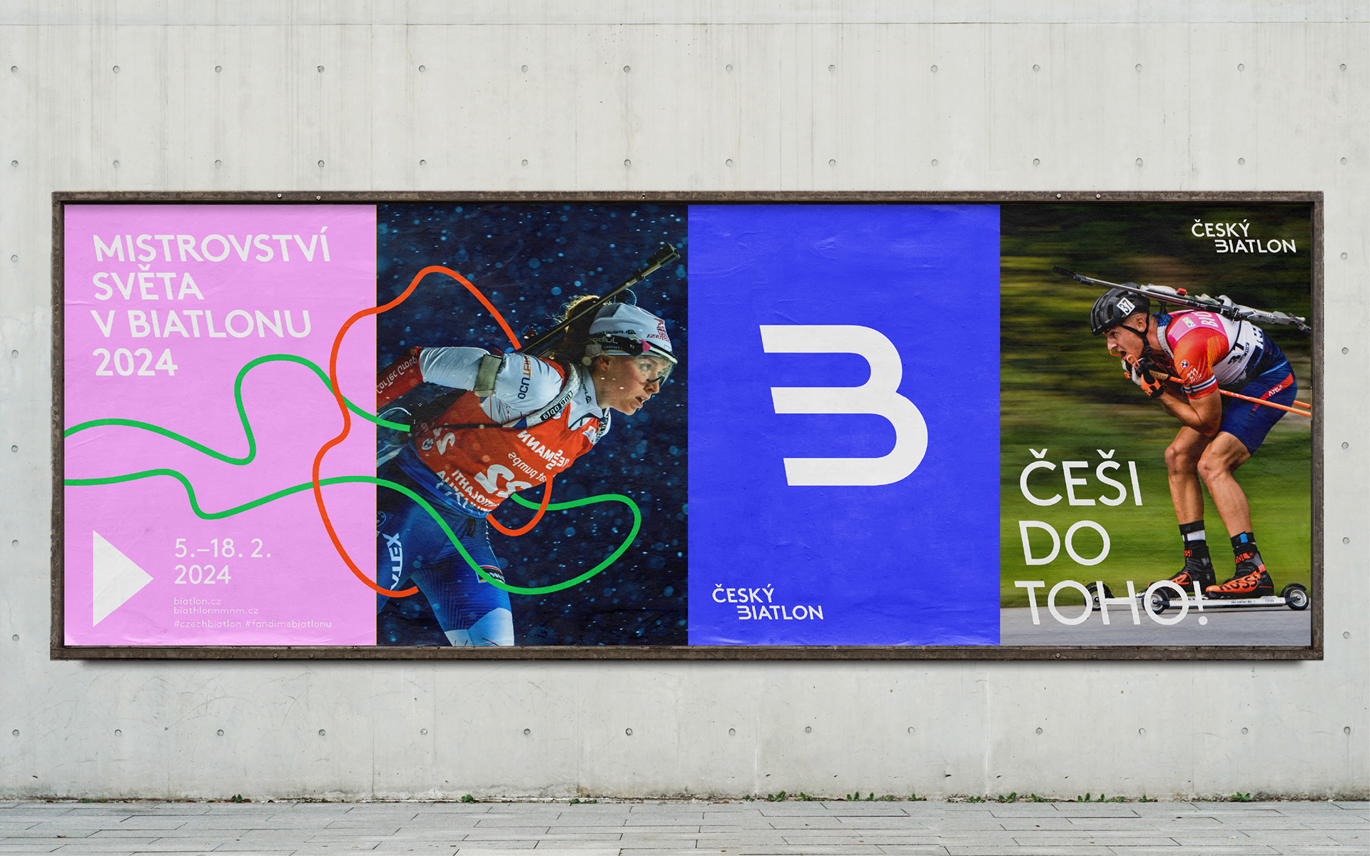
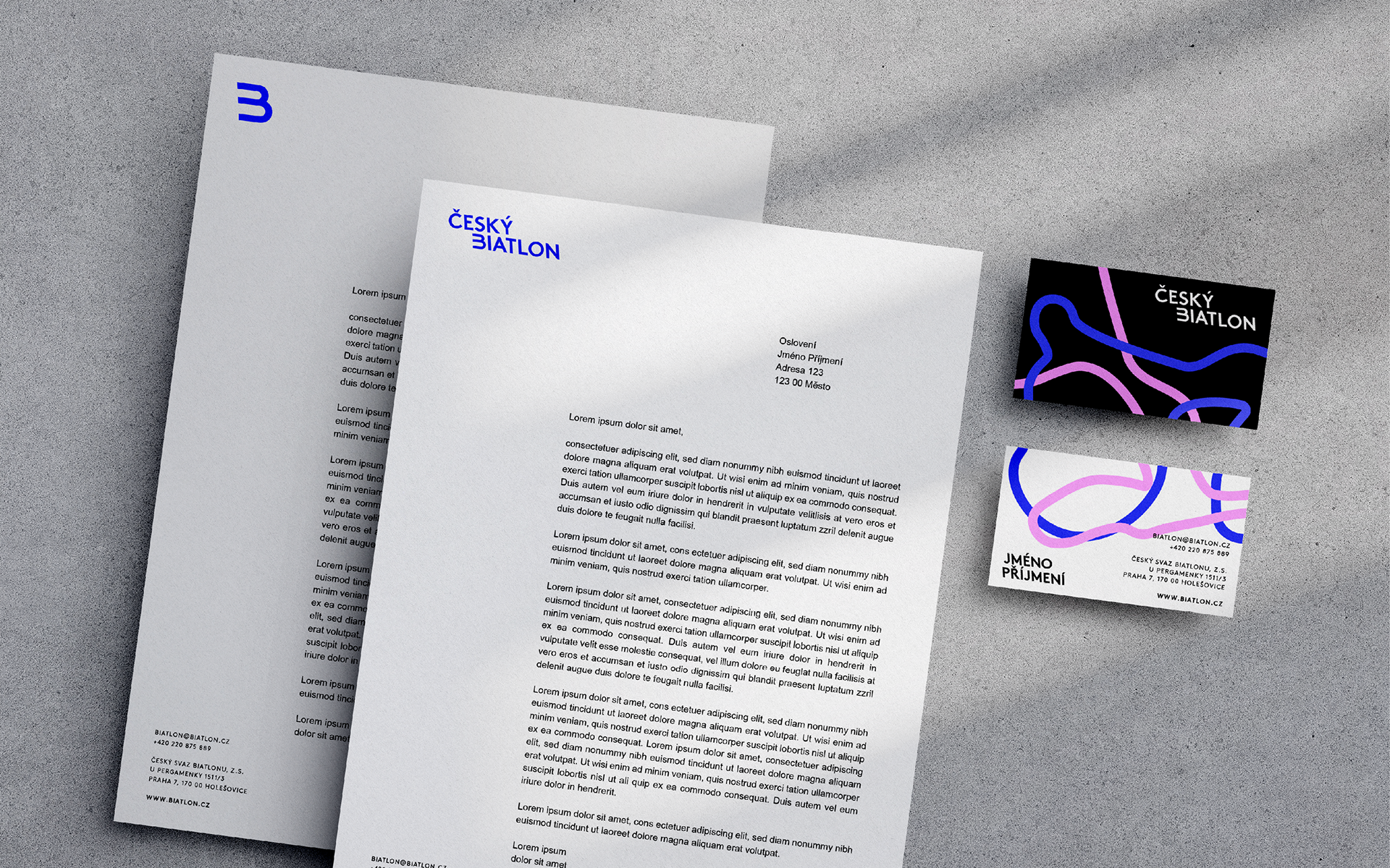
The combination of the lines, the characteristic reverse italics and the unique colour scheme creates a variable palette of memorable elements that we can easily use in both online and offline environments. The lines also subtly blend into the photos, giving them a playful character. The visual identity thus accurately reflects the main characteristics of the sport and its fans.